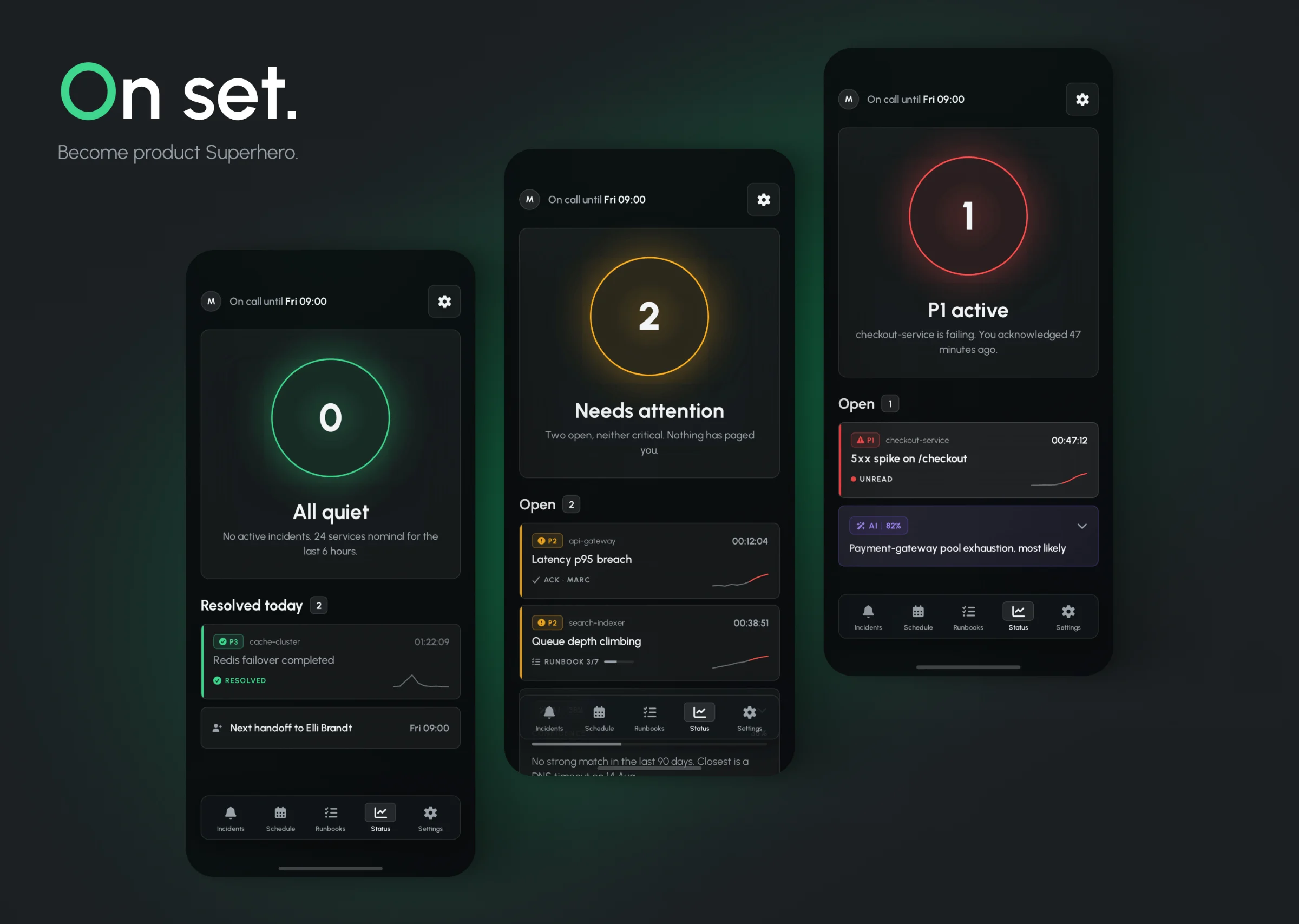
Accessibility scanners report symptoms page by page. Konform reports causes - and turns a 3,187-row backlog into 142 decisions. One row is one fix: every contrast failure traced to the same ghost button is a single change, not ninety-four. What used to be a sprint of spreadsheet work is now an afternoon of triage.
Self-initiated concept project · 2026
02 / THE PROBLEM
THE LIST ISN'T THE PROBLEM.THE UNIT IS.
Since June 2025 the European Accessibility Act has been enforceable in Germany as the BFSG. Fines reach €100,000. Since late 2025, formal warnings have been rising.
Finding violations is solved - axe, WAVE and Lighthouse are free. A scan of a 240-page site returns 3,187 of them.
Every tool on the market lists those violations by page: /checkout has 47, /product/1042 has 45, and so on for 240 rows. For a content site that works. For a React product it doesn't - nobody fixes a page. They fix a component.
Teardown of 5 platforms - Siteimprove, Level Access, axe Monitor, Silktide, Pope Tech - confirmed it: all five organise remediation around URLs. So the deduplication happens in someone's head, in a spreadsheet, at the start of every sprint.
03 / THE UNIT
ONE ROW IS NOT ONE ERROR.IT'S ONE FIX.
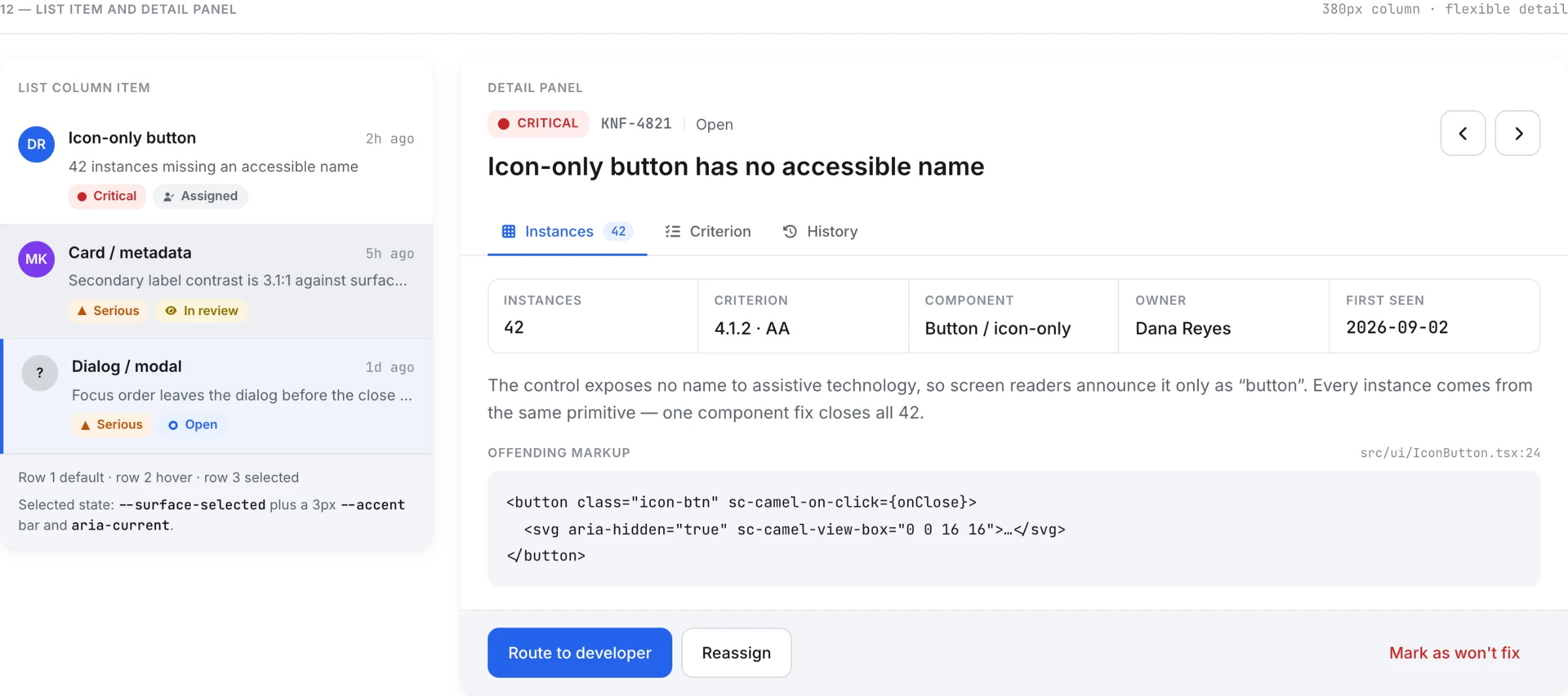
Konform groups violations by their source component. 847 contrast failures across 94 pages become one row: Button/ghost. Fix it once, close all 847.
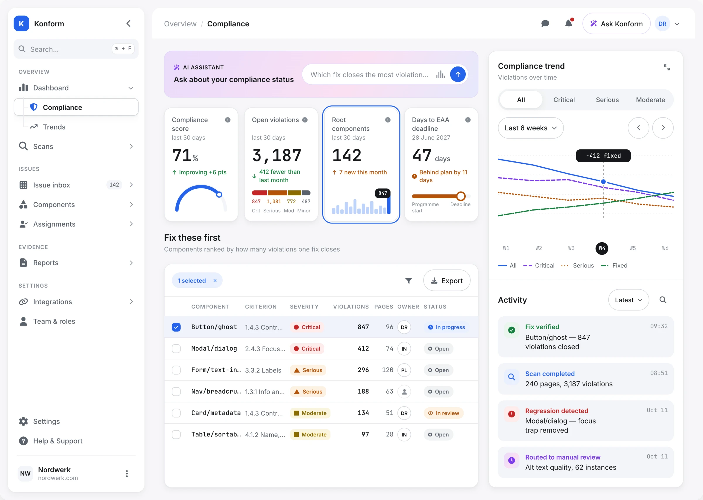
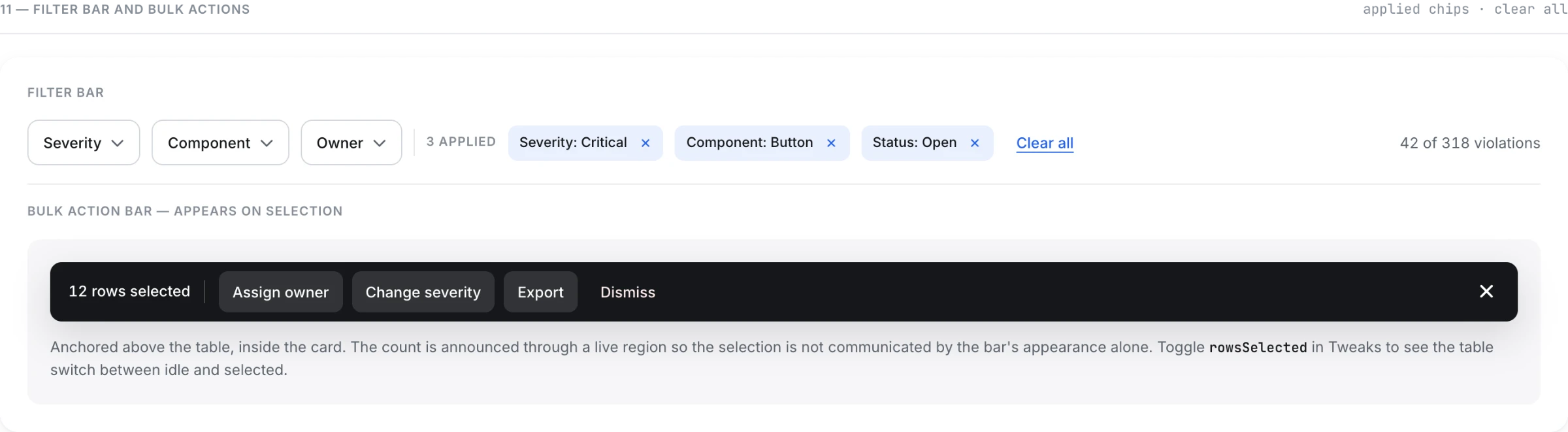
The inbox is sorted by impact - how many violations one fix closes - not by severity or by date. 14 components cause 61% of everything found.
3,187 violations → 142 rows. Average 22 violations closed per fix.
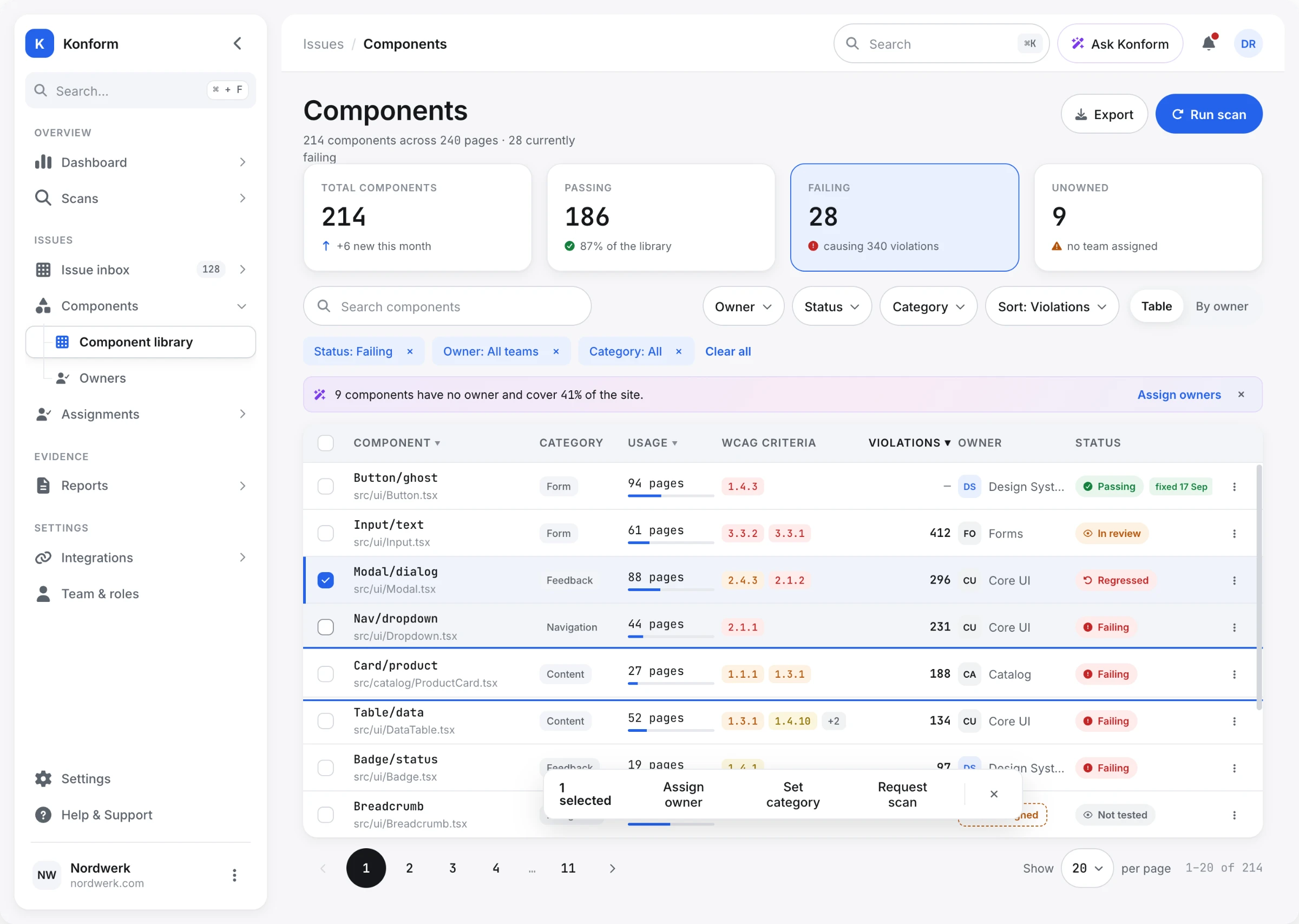
A second view, the component registry, holds all 214 components on the site - passing, failing and untested - with their owner and their reach. It answers the question the inbox can't: which team carries the risk, and what has already been made safe.
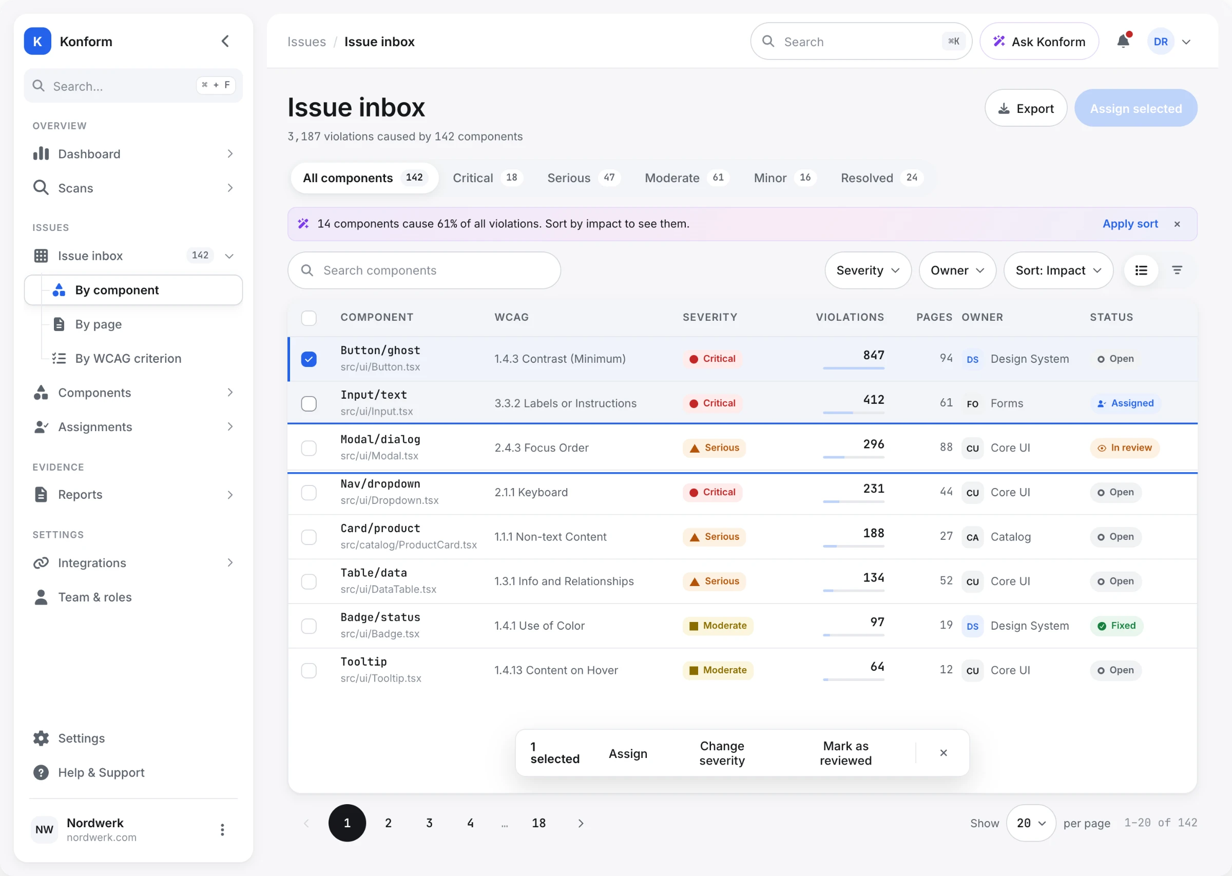
A "by page" toggle stayed in the design. Auditors and legal teams still think in URLs, and a tool that refuses their mental model doesn't get adopted.
04 / AI
THE USEFUL PART OF AIIS WHERE IT STOPS.
Automated checks cover roughly a quarter of WCAG 2.1 AA criteria. A machine can measure a contrast ratio. It cannot judge whether alt text is meaningful or whether reading order makes sense.
So the AI layer does two things, and the second one matters more.
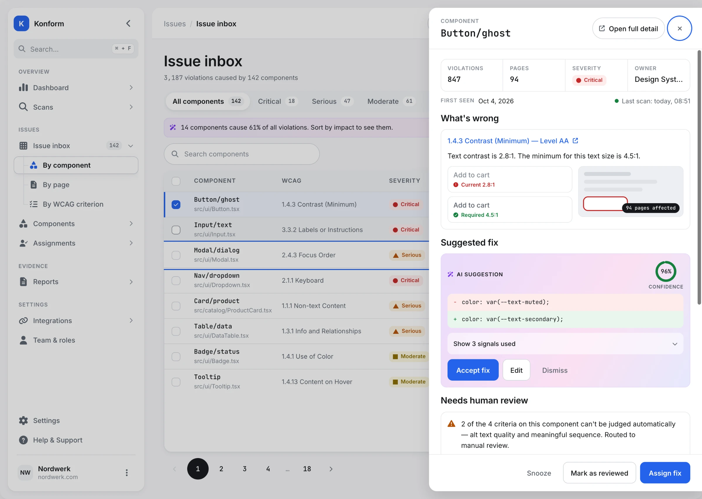
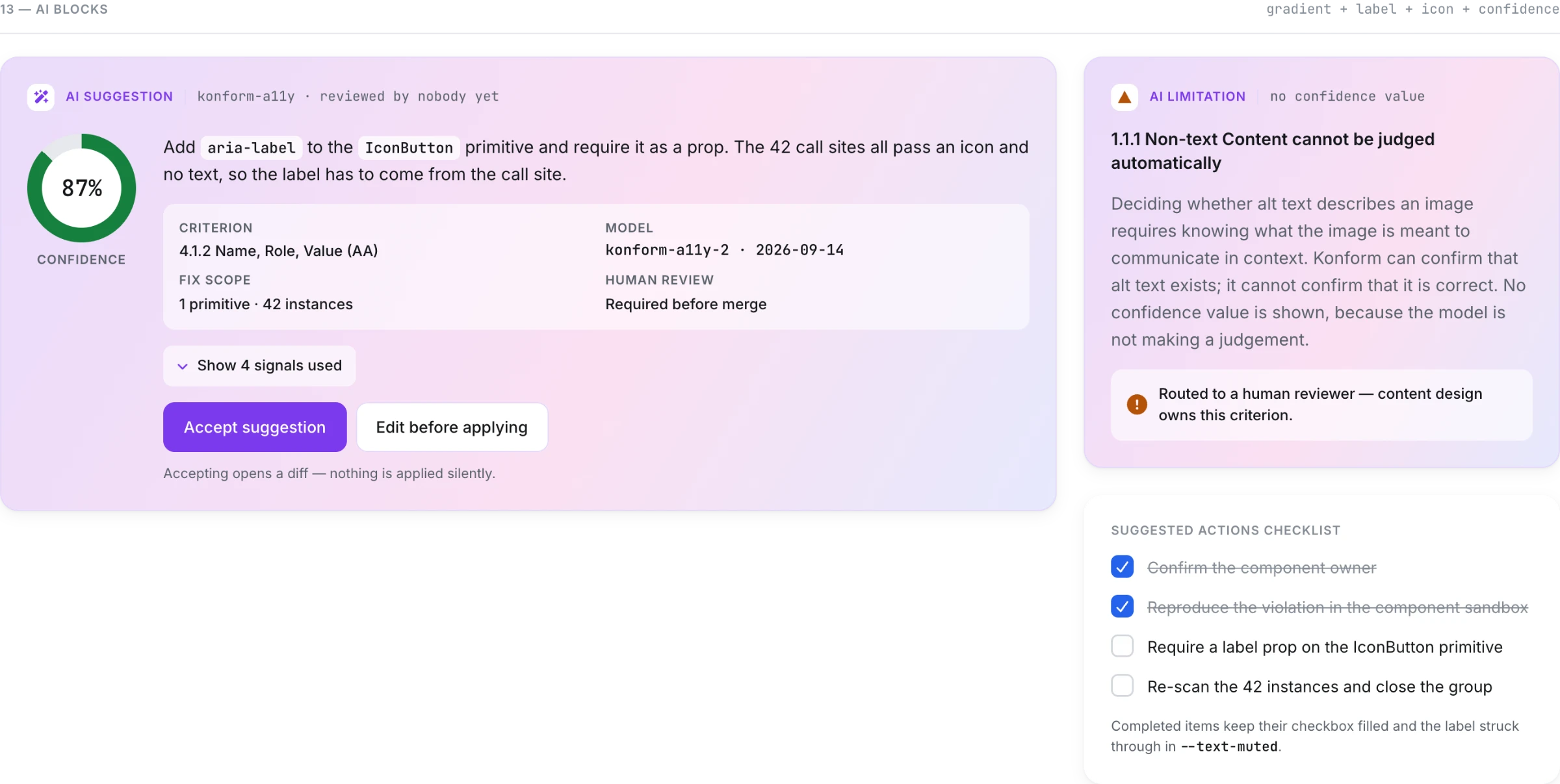
It proposes a fix - a code diff, with a confidence value and the signals it used, both visible before you accept anything.
And it refuses. Criteria it cannot judge are routed to manual review with the reason stated: "2 of 4 criteria on this component can't be judged automatically - alt text quality and meaningful sequence."
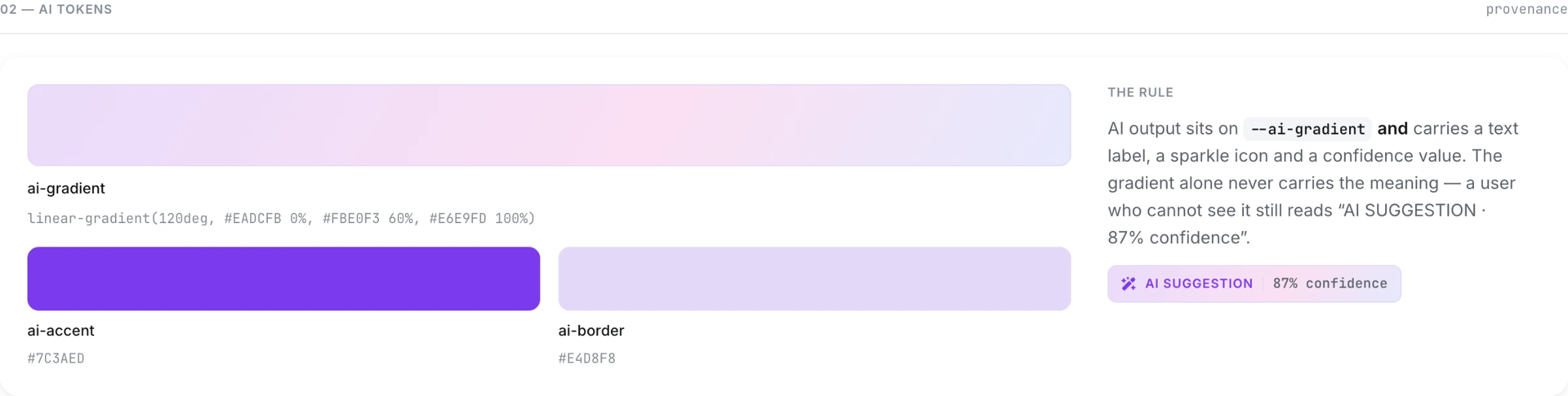
Every AI surface carries the same three markers: the gradient, the label, and a confidence value written as text. The gradient alone never signals provenance - that would fail the product's own accessibility rules.
A tool that claims to fix everything is a tool nobody trusts with a legal deadline.
05 / CONSEQUENCE
SHOW THE CONSEQUENCEBEFORE THE CONFIRMATION.
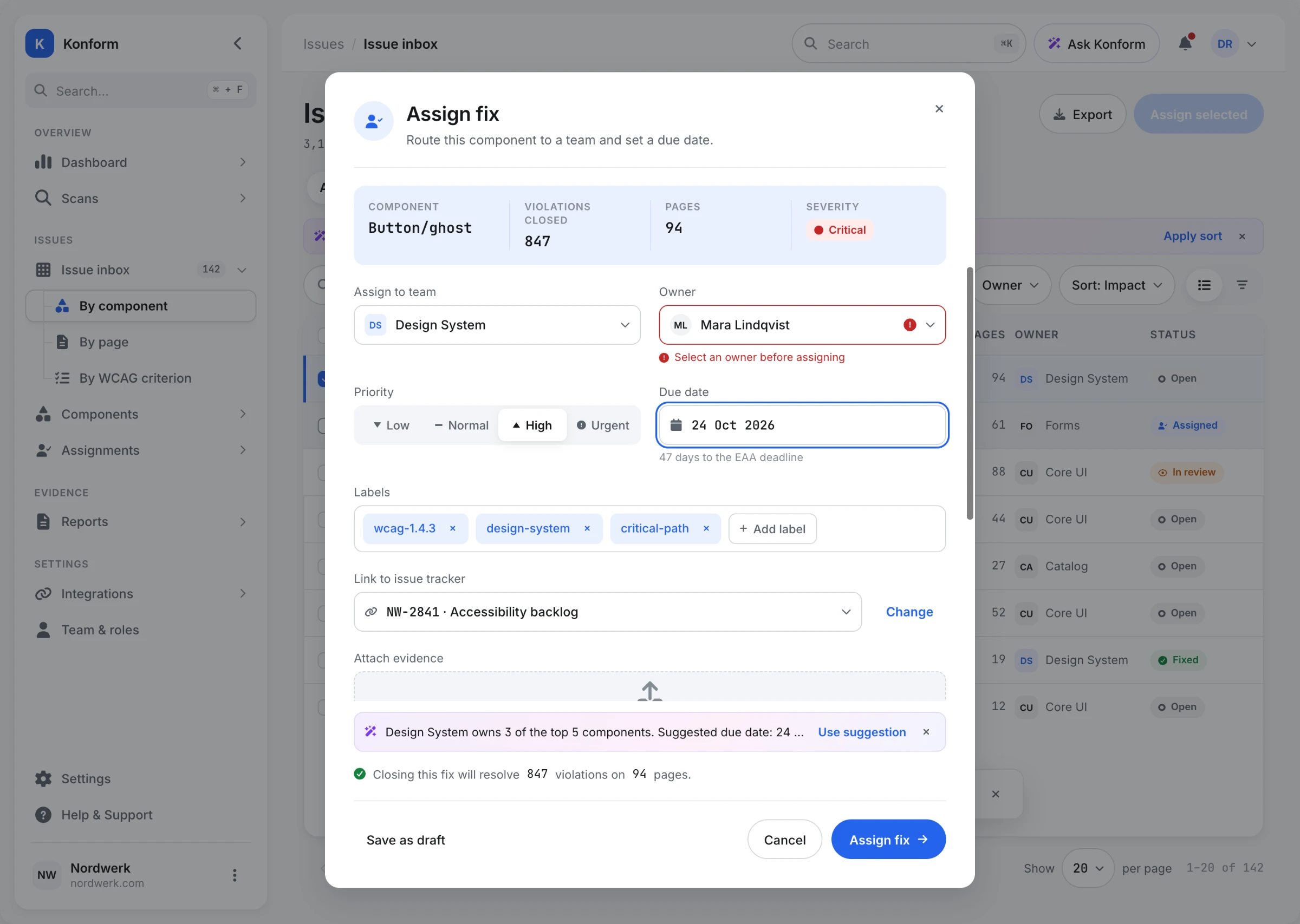
Assigning a fix is a small action with a large effect. One row routed to one team closes 847 violations on 94 pages - or blocks them for three weeks if the due date is wrong.
So the modal states the effect twice. A strip at the top holds the numbers - component, violations closed, pages, severity. A line above the buttons repeats it in plain language: "Closing this fix will resolve 847 violations on 94 pages."
The due date field carries the deadline next to it - "47 days to the EAA deadline" - because the number that matters isn't the date, it's the distance to the date.
The AI hint here is one line, not a panel. It suggests an owner and a date based on who owns the neighbouring components, and it can be dismissed without touching the form.
06 / TWO USERS
SAME DATA.TWO DIFFERENT PRODUCTS.
An accessibility lead and a frontend developer need opposite things from the same scan.
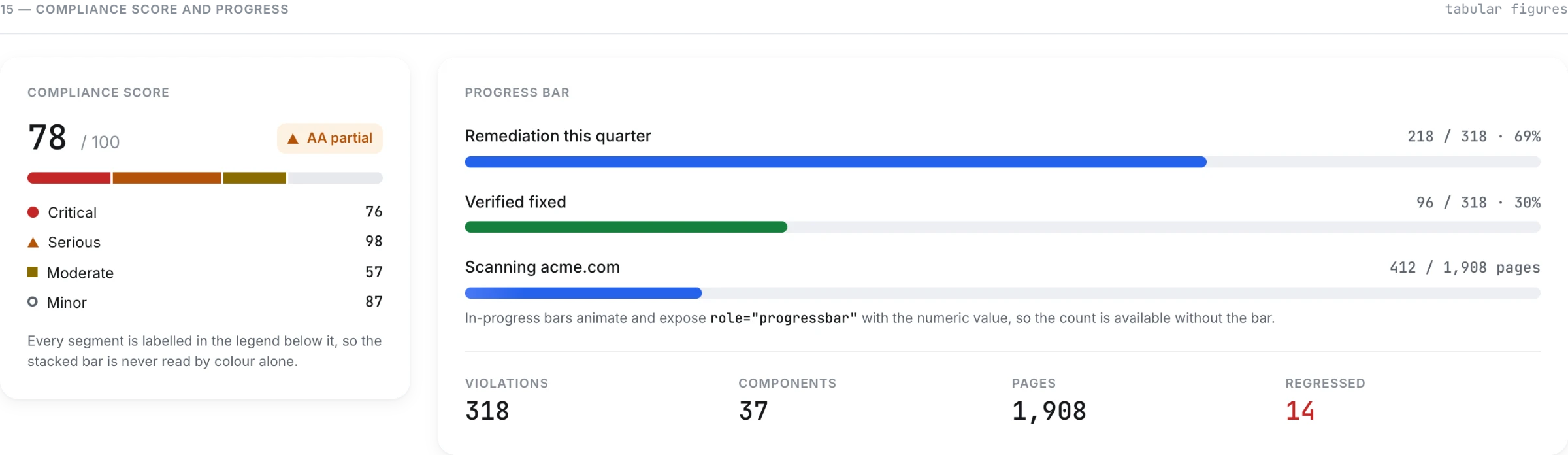
The lead needs the shape of the problem: compliance score, violations by severity, what moved this month, days to the deadline, and the components to fix first. Wide layout, three columns, everything comparable at a glance.
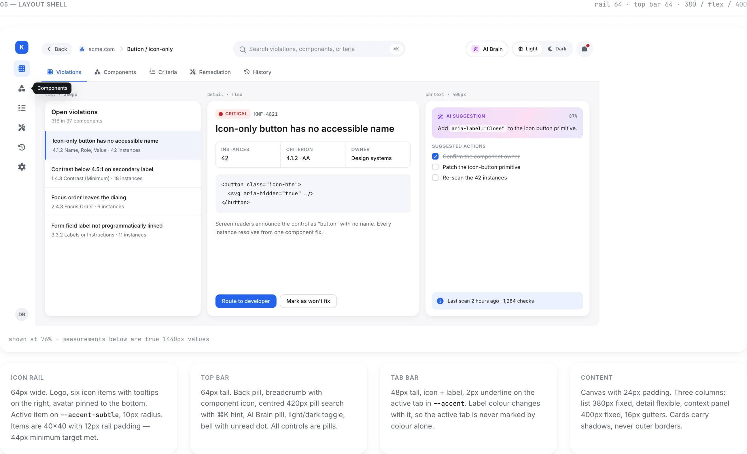
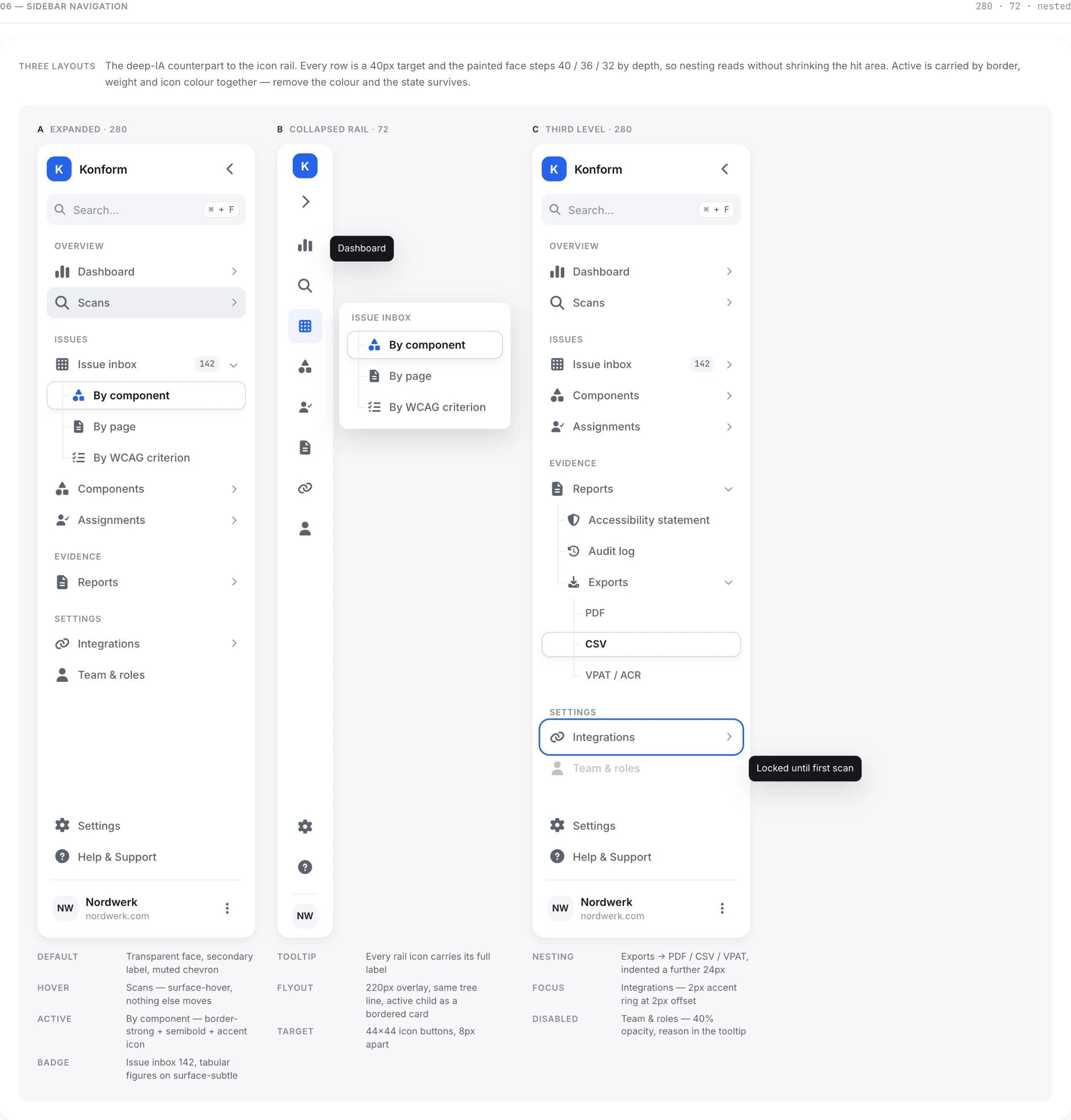
The developer needs one task and no distractions. Collapsed sidebar. Three panes: the files involved, the code diff at line 42, and a live preview of the page with the offending element outlined. Contrast before and after, printed as numbers. Three verification checks, one of which openly says "needs human review".
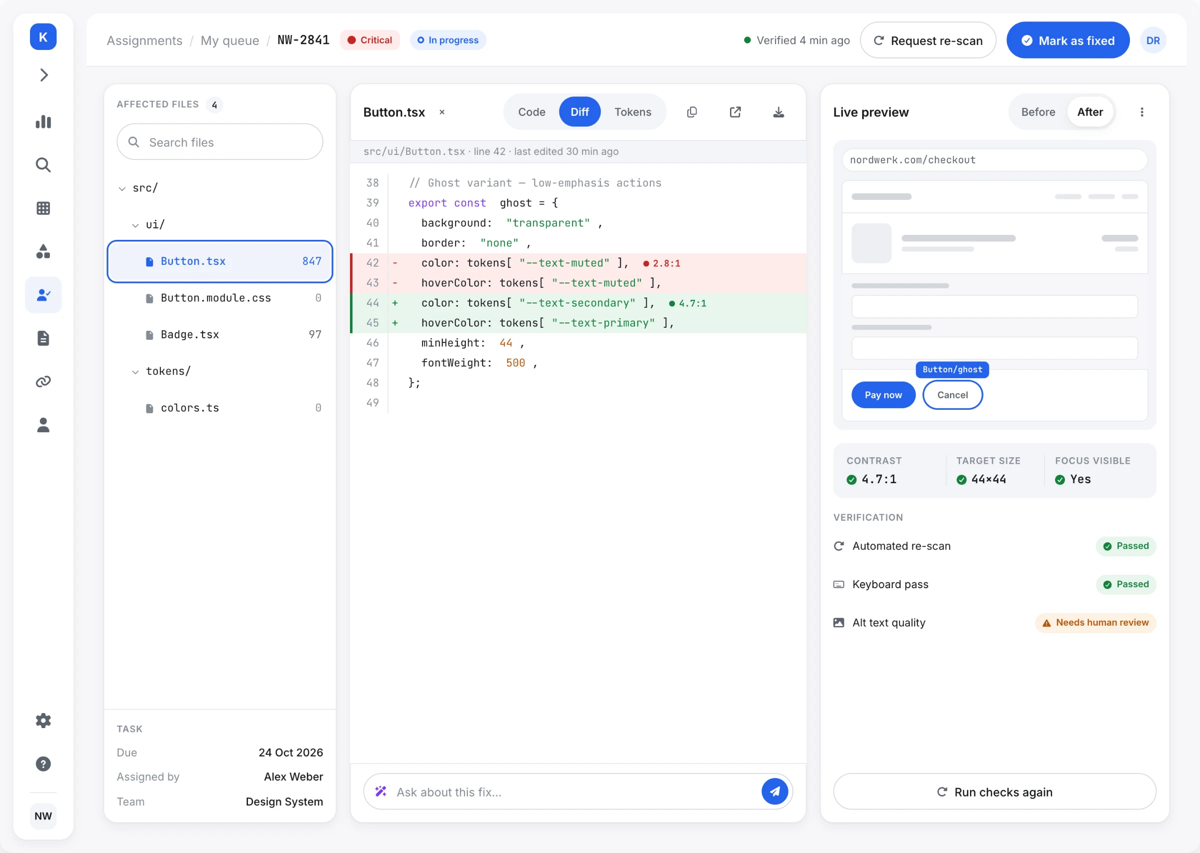
Role-based access isn't a permissions table - it's two different products sharing one data model.
07 / PROOF
A FIX ISN'T DONEUNTIL IT'S PROVABLE.
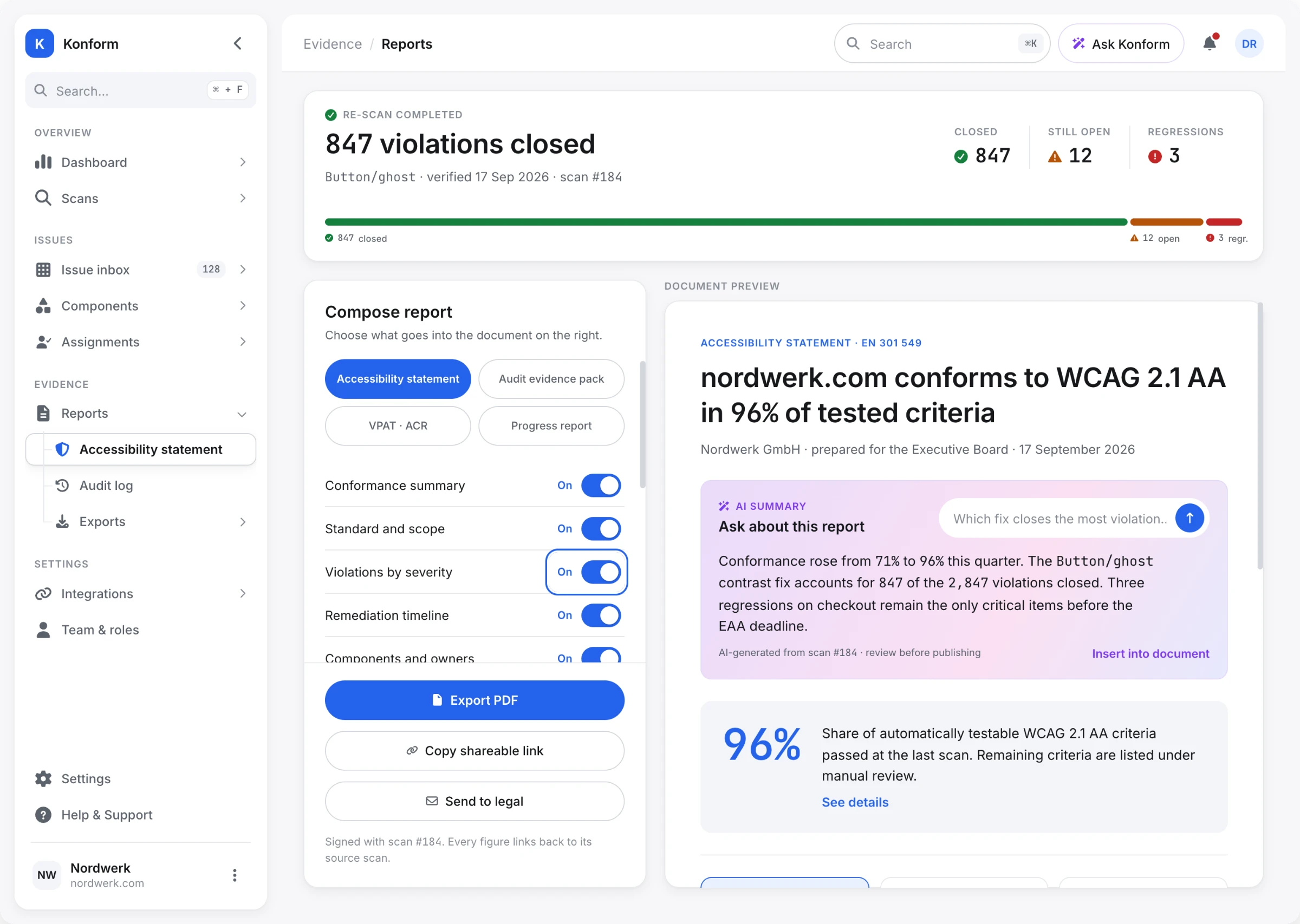
Under the BFSG, an accessibility statement is an obligation in its own right - separate from the fixes themselves. Missing or weak statements are one of the most common grounds for a formal warning.
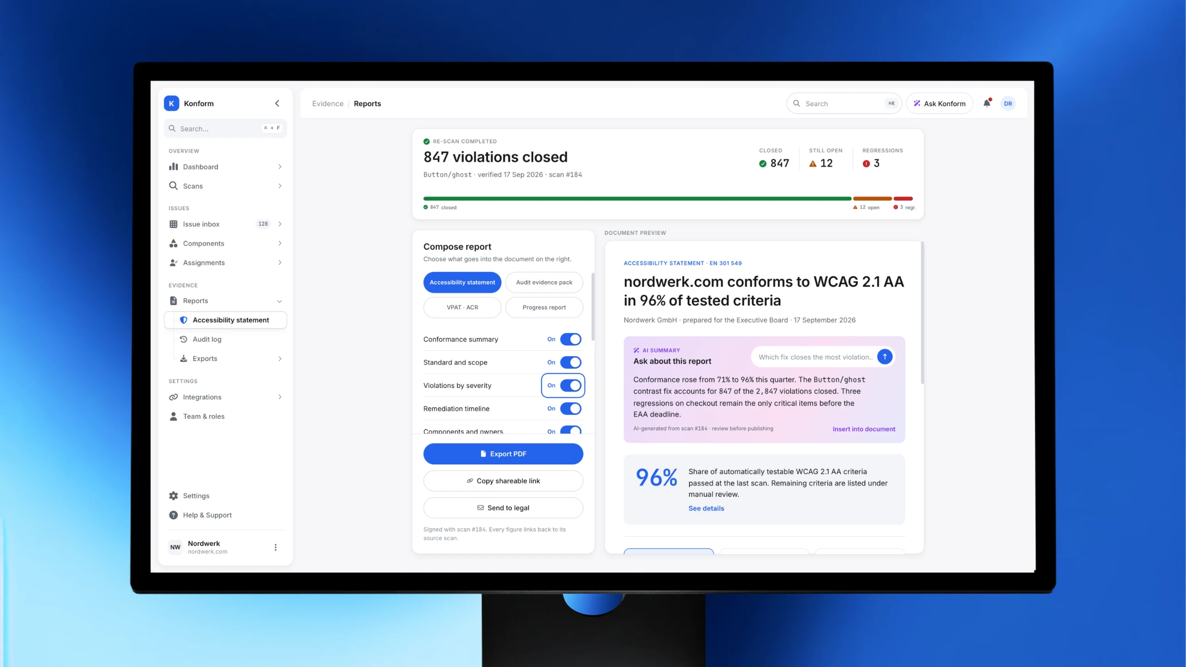
So the last screen turns scan data into a document. Section toggles on the left, live document preview on the right. Report type switches between accessibility statement, audit evidence pack, VPAT/ACR and progress report - four audiences, one dataset.
Two things make it defensible.
Every figure is traceable. The document is signed with the scan it came from - scan #184 - and each number links back to its source.
The method is printed inside the document. A block states how the 96% is calculated: passed criteria ÷ automatically testable criteria (39 of 50), with the scope and crawl date. A statement that hides its formula is the one that gets challenged.
Above it, the re-scan result: 847 closed, 12 still open, 3 regressions. Regressions are shown, not hidden - a fix that came back is the thing an auditor asks about first.
08 / THE SYSTEM
A TOOL ABOUT ACCESSIBILITYGETS AUDITED FIRST.
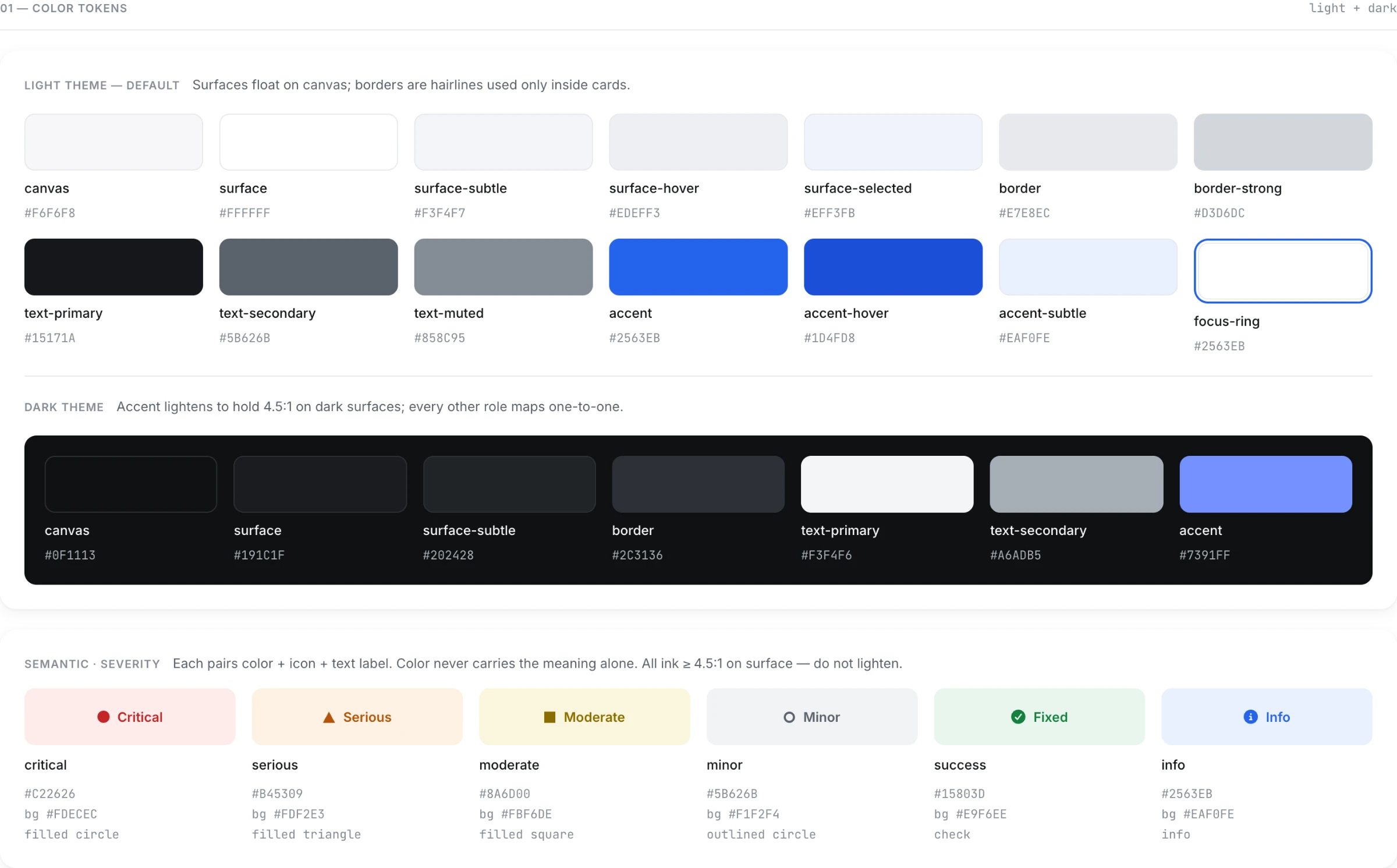
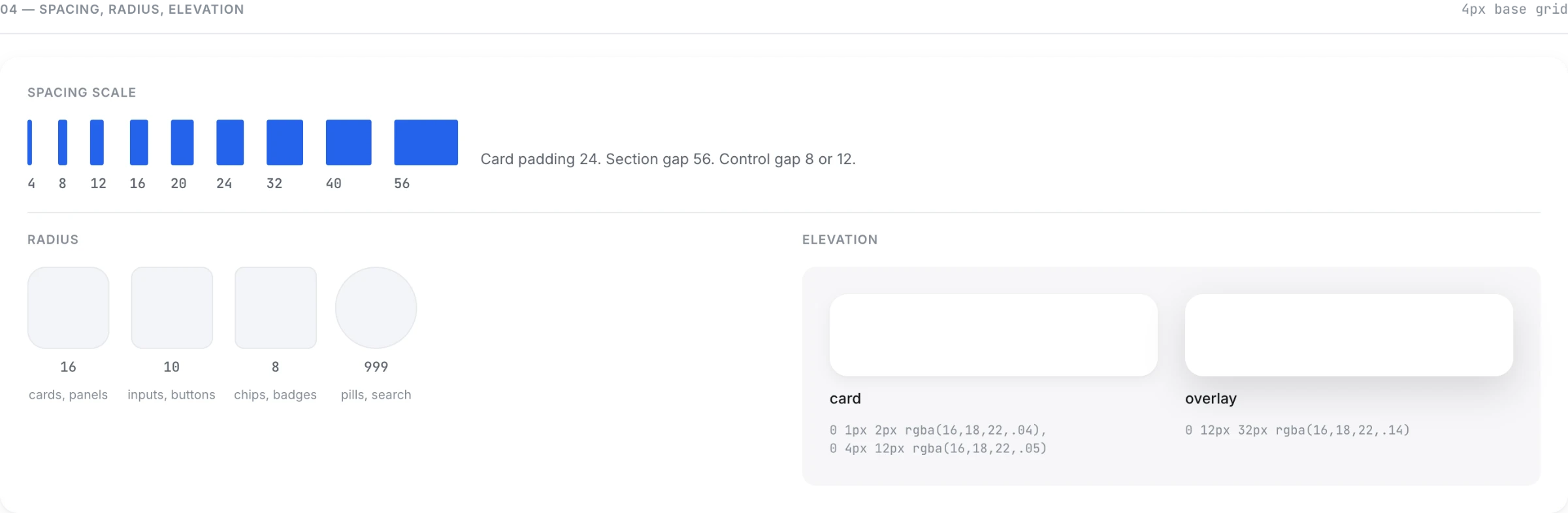
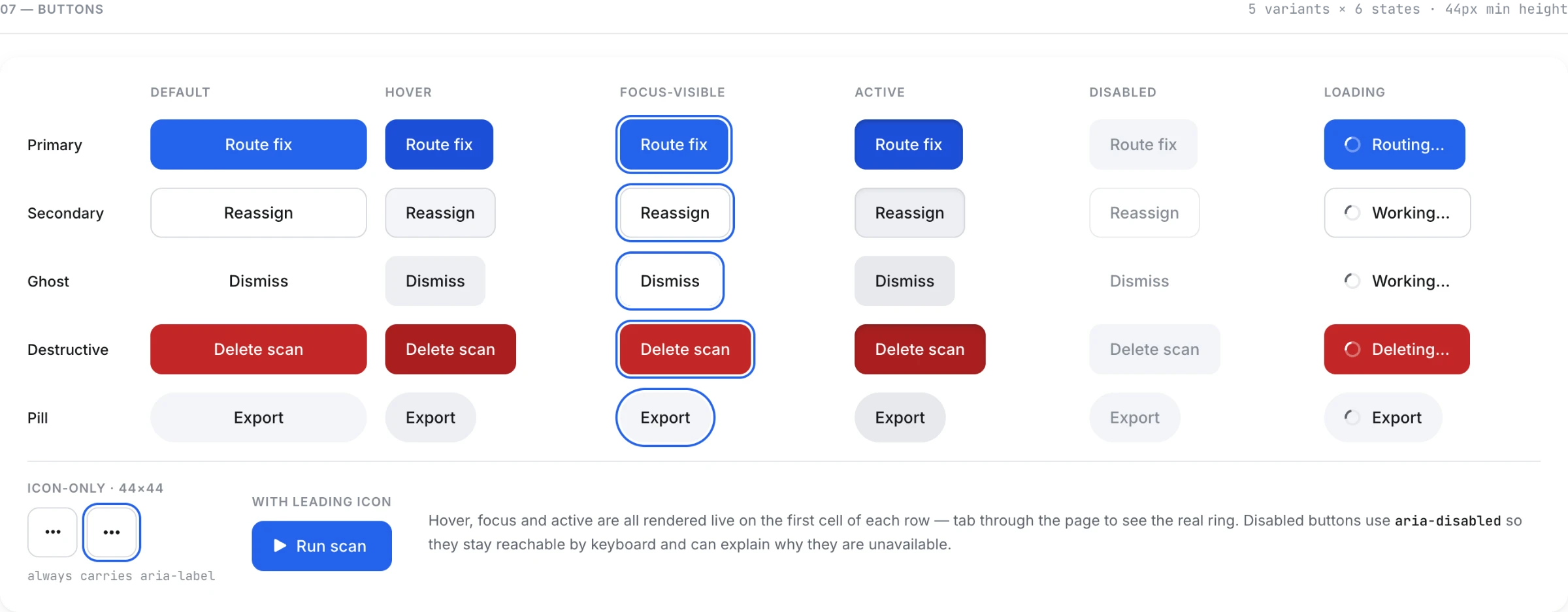
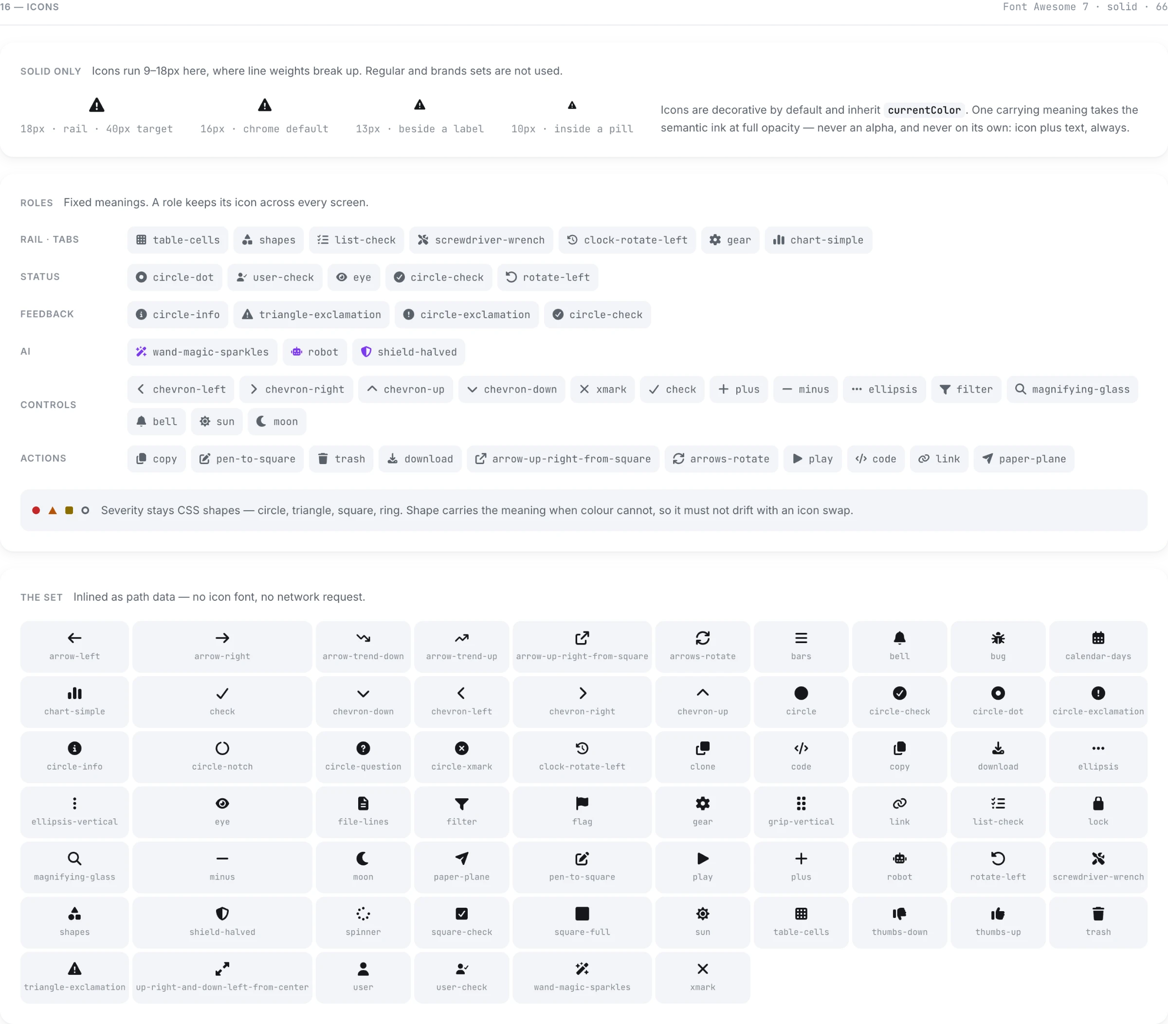
The design system came before the screens. 214 tokens, 38 components, light and dark on the same semantic layer.
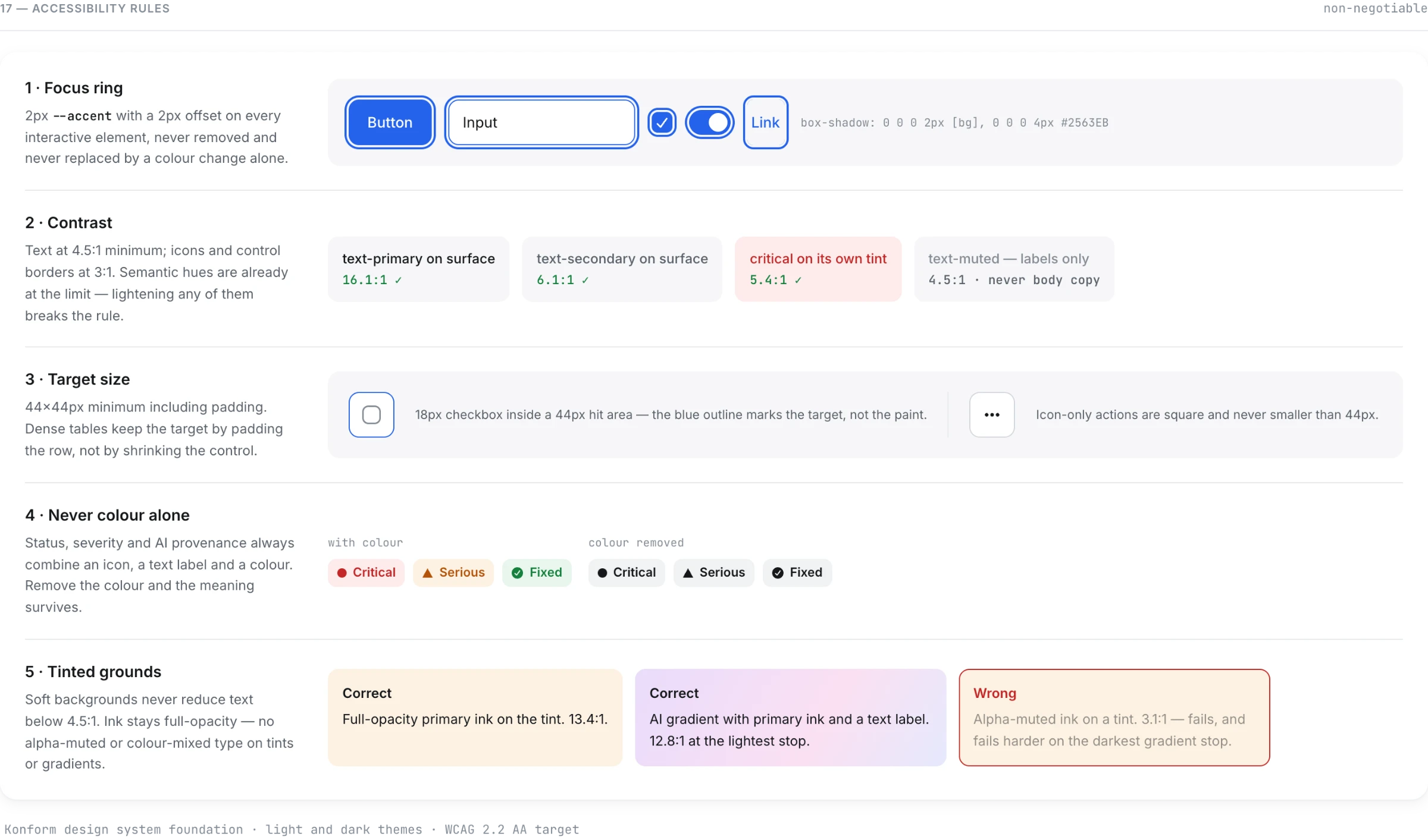
Four rules held across every screen.
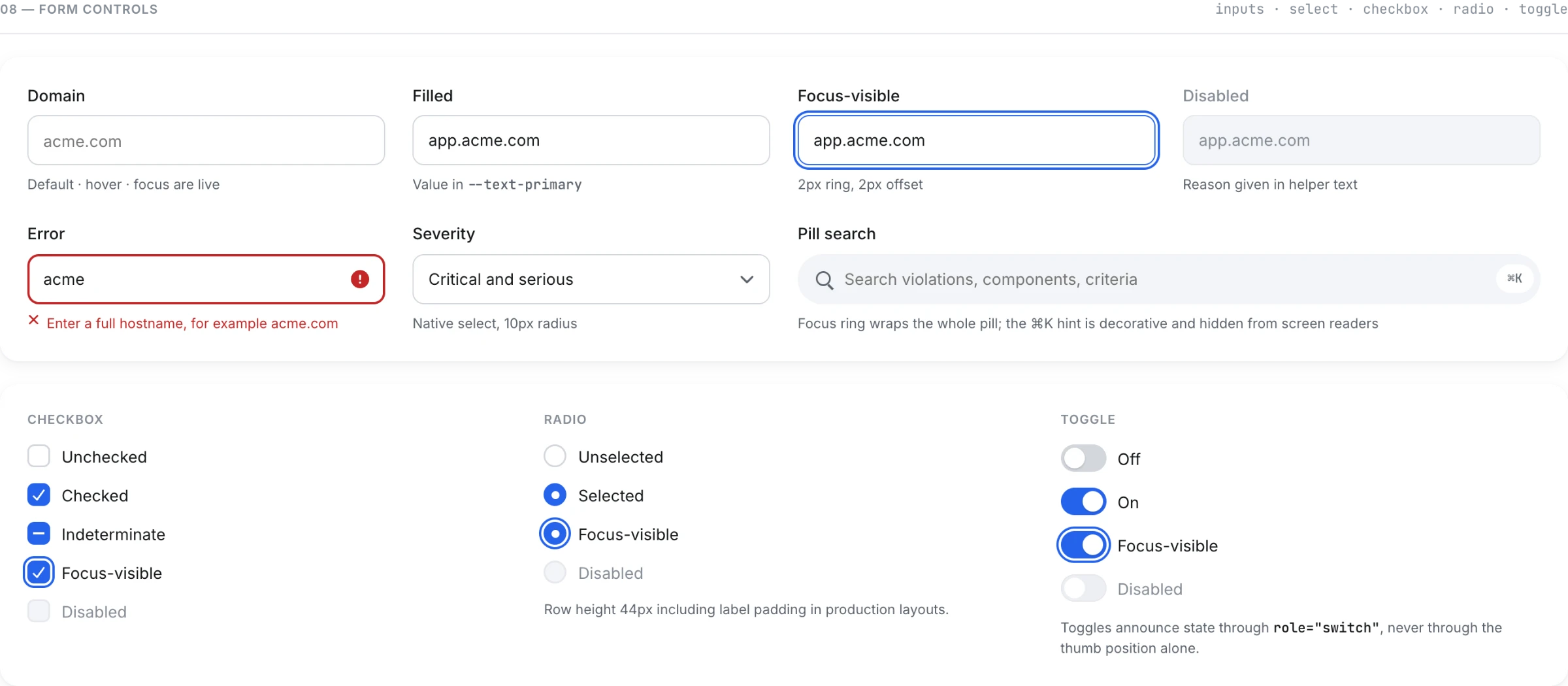
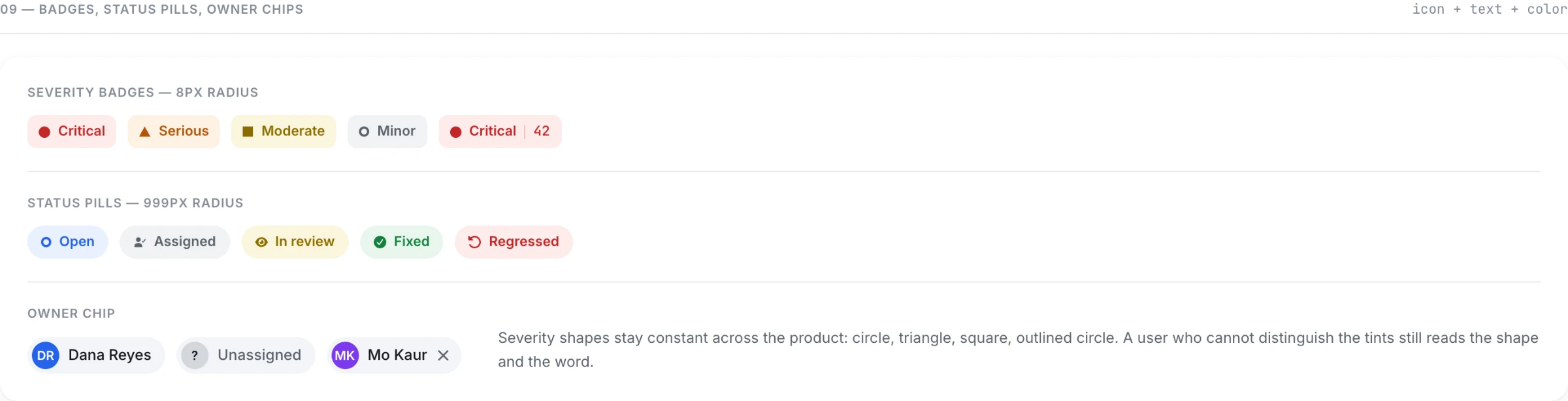
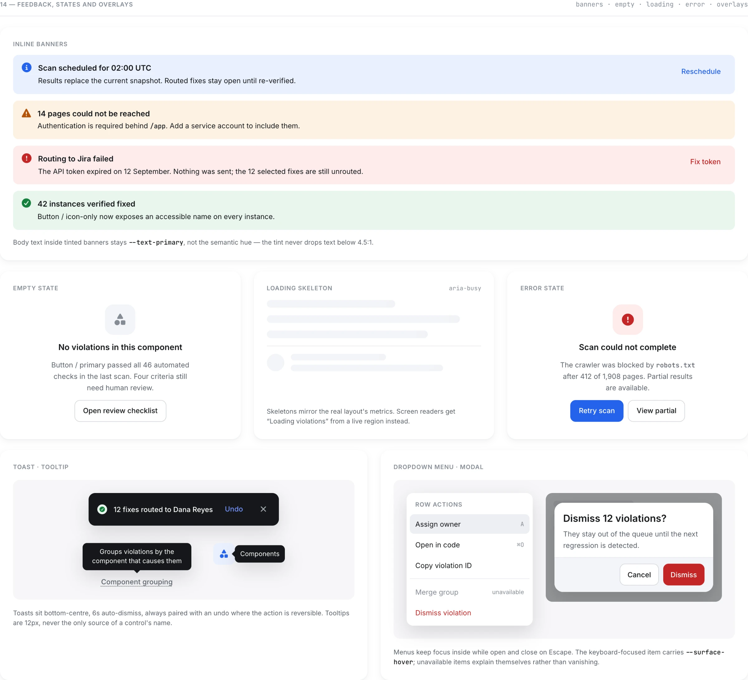
- Nothing is carried by colour alone. Severity, status and AI provenance each combine an icon, a text label and a colour. Every severity colour clears 4.5:1 against its surface - which meant darkening the standard warning orange and green until they did.
- Focus is designed, not inherited. A 2px ring at 2px offset, rendered as an explicit state in the system rather than left to the browser.
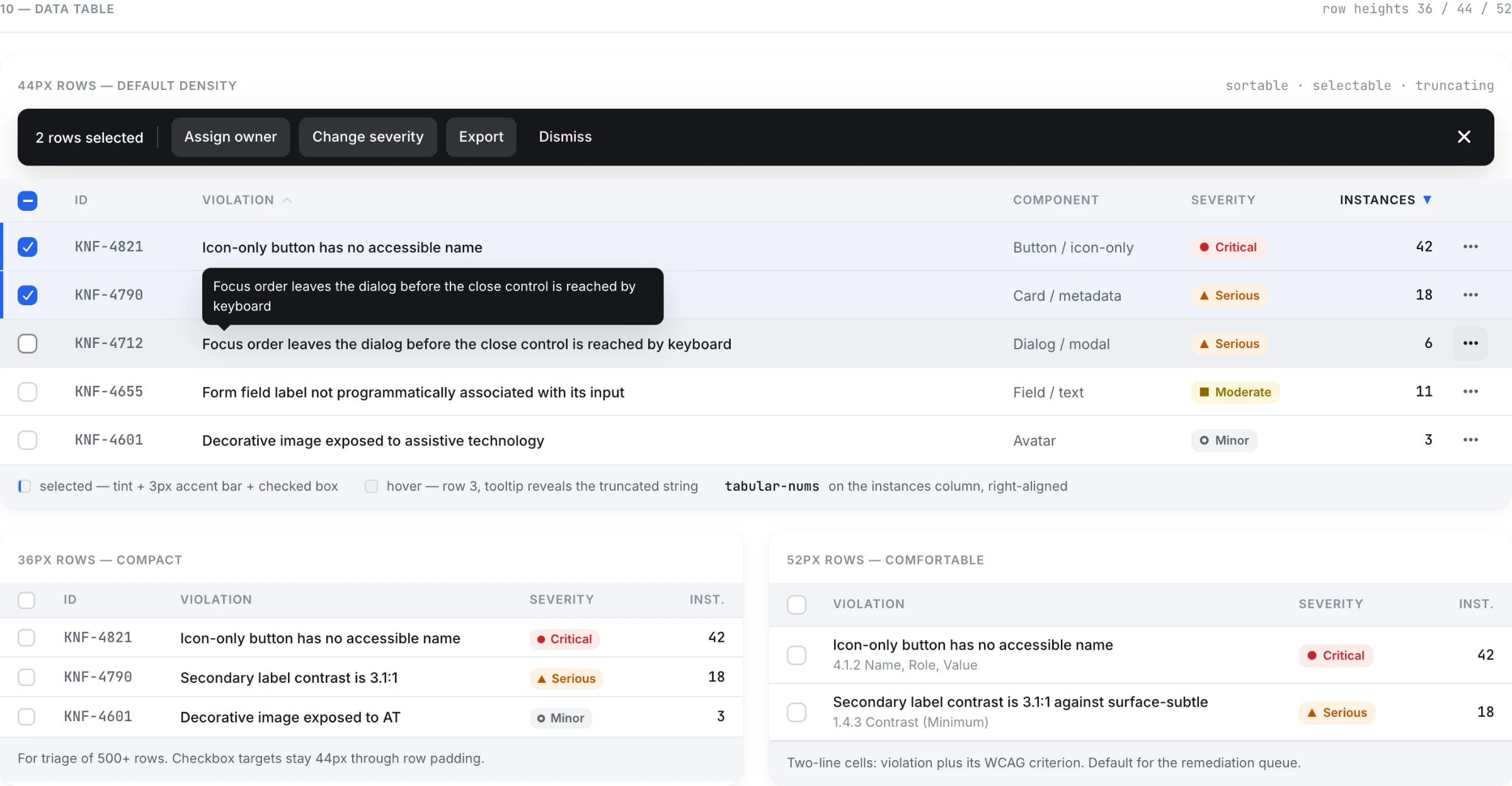
- Density is a token, not a decision. Table rows come in three heights - 36 / 44 / 52px - because a 142-row inbox and an 8-row summary are not the same table.
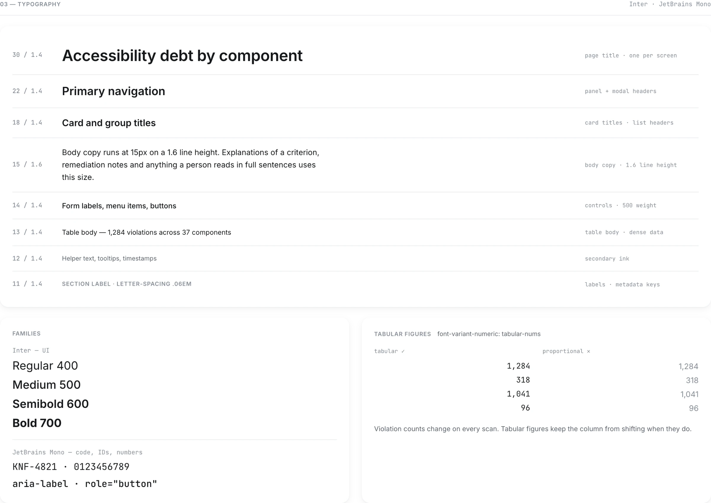
- Numbers are tabular everywhere they're compared.
- axe DevTools0 violations
- Body contrast4.7:1
- Keyboard4 flows passed
- Targets44×44 minimum
09 / THE FLOW
CONNECT. TRIAGE.FIX. PROVE.
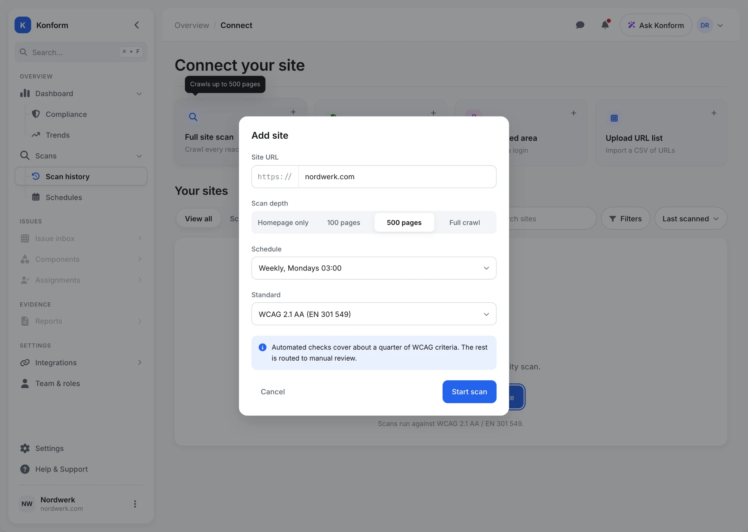
The full flow, in order.
10 / RESULTS
WHAT CHANGED.
| Measure | Before and after | Change |
|---|---|---|
| Triage time | 14 h → 1 h 50 | −87% |
| Backlog items | 3,187 → 142 | −96% |
| Violations per fix | 1 → 22.4 | ×22 |
| Scan to first assignment | 3 days → 18 min | −99% |
| Developer time per task | 40 → 12 min | −70% |
| Statement preparation | 2 days → 4 min | −99% |
| Conformance, 6 weeks | 71% → 96% | +25 pts |
Usability test · 8 participants · unmoderated, against an existing tool
| Task | Konform | Control |
|---|---|---|
| Find the highest-impact fix | 8/8 · 34 s | 5/8 · 4 m 12 s |
| Assign it with a due date | 7/8 · 51 s | 6/8 · 2 m 05 s |
| Assemble evidence for legal | 6/8 · 1 m 40 s | 3/8 · 6 m 30 s |
| SUS | 84.5 | 61.2 |
The third task failed for three participants - they looked for export under Reports, not on the product card. Moving the entry point fixed it: 8/8 at 58 s on the second run.
11 / LIMITS
WHAT THIS IS,AND WHAT IT ISN'T.
This is a self-initiated concept project, not a shipped product. No customer, no production data, no engineering team to argue with.
What that means in practice:
- The scan engine is assumed, not designed. Grouping violations by source component depends on mapping DOM nodes back to components - solvable, but a technical problem I haven't solved here.
- Two roles are covered. Procurement, agencies managing multiple clients, and content editors all have a claim on this product and none of them are designed for.
- The manual review track is named, not built. It's the half of WCAG that automation can't reach, and it deserves its own case study.
- Numbers come from the prototype test and the design targets, not from a production deployment.
Next: the manual review queue, and multi-site governance for agencies.