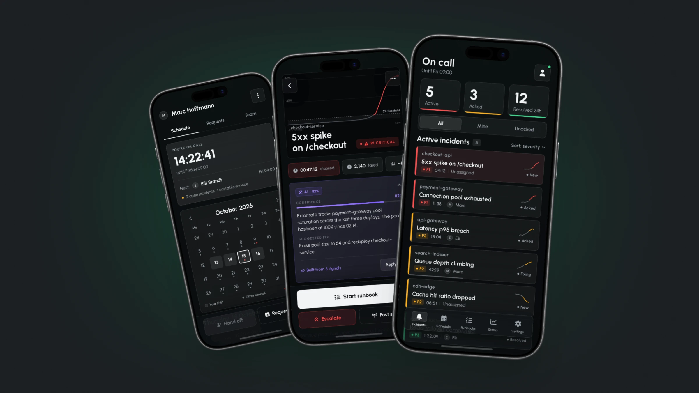
Onset - an on-call incident response app for the moment an engineer is woken by an alert and has to choose, in the dark, whether to take it or hand it on.
Self-initiated concept project · 2026
02 / THE PROBLEM
THE TOOL IS BUILT FOR A DESK.THE INCIDENT ISN'T.
On-call means carrying the pager for a week. Most of that week is quiet. The product only matters in the minutes it isn't.
At 03:40 an alert fires. The engineer is in bed, in the dark, holding the phone in one hand, with maybe a minute of coherent thought. The decision is small and consequential: take it, or escalate to someone who can.
Every incident platform on the market was designed for a browser and given a phone app afterwards. A teardown of five - PagerDuty, Opsgenie, incident.io, Grafana OnCall and Better Stack - showed the same shape in all of them: the mobile app is a viewport onto a web product. Dense text, full-brightness white surfaces, primary actions in the header, and severity communicated by reading rather than by seeing.
None of that is wrong at a desk. All of it is wrong at 03:40.
Onset starts from the opposite end. It assumes the phone is the only device, the room is dark, one hand is occupied, and the user is not yet fully awake.
03 / THE SYSTEM
A PRODUCT USED AT 3AMIS A PRODUCT ABOUT LIGHT.
The design system came before the screens, so it comes first here too: seven foundation pages and 15 documented components, with every state rendered rather than described. Everything in the scenarios below is built from these parts.
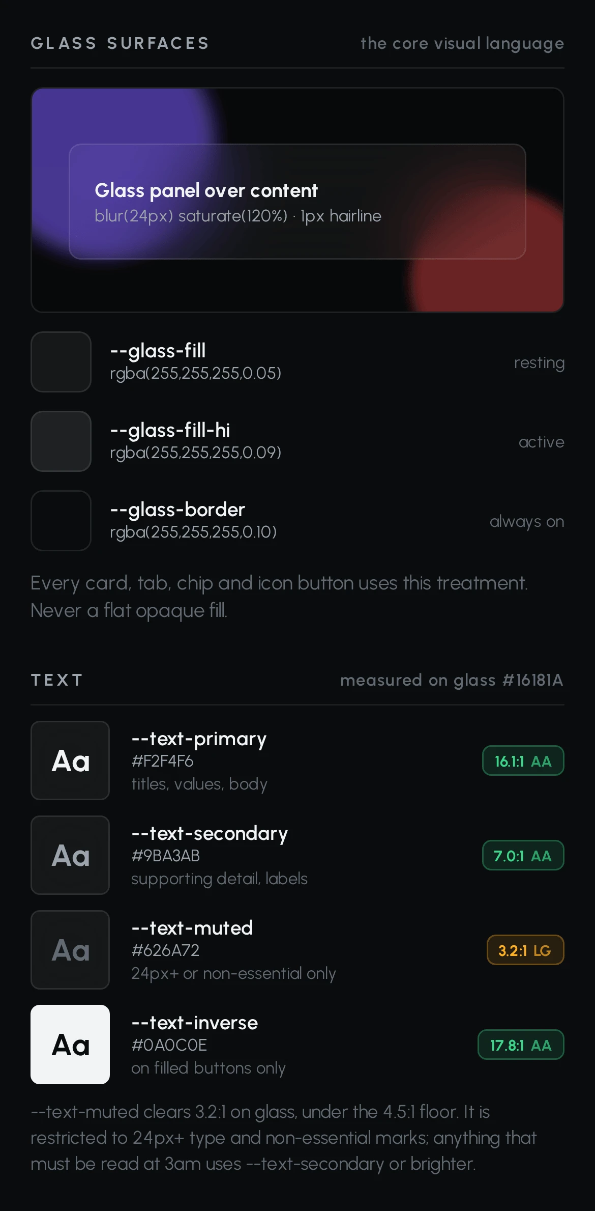
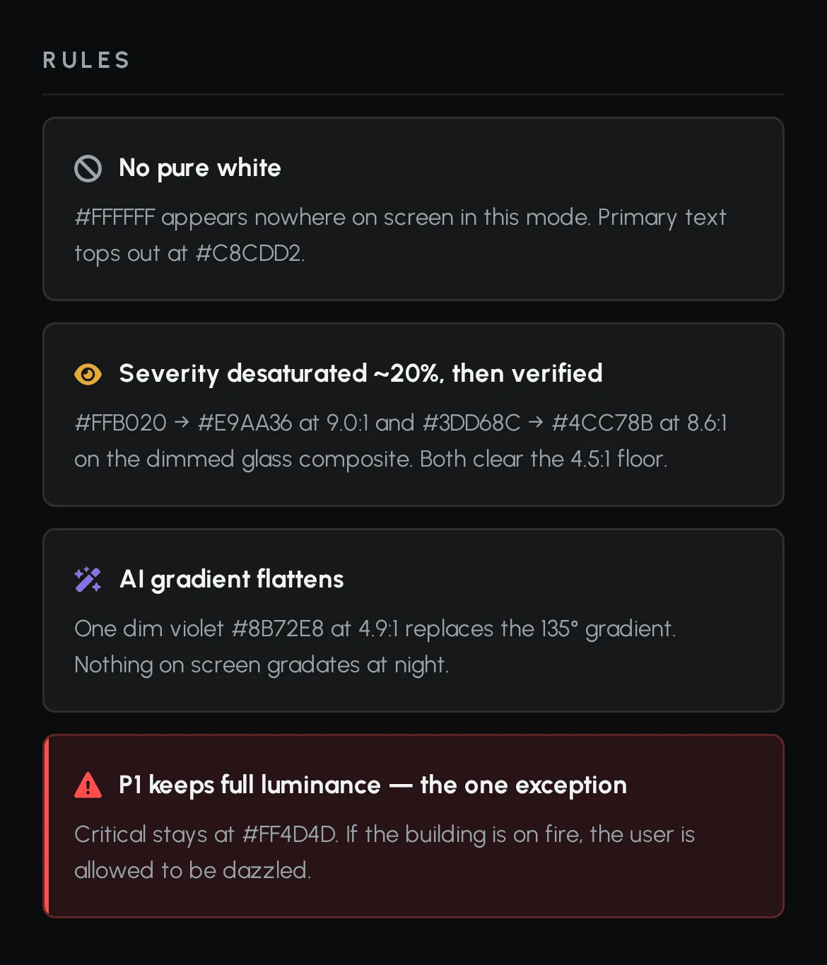
Its most specific decision is a second mode. Night Dim is enabled automatically during the user's quiet hours. Pure white appears nowhere; primary text tops out below it. Glass surfaces drop to a third of their opacity. Severity colours desaturate by roughly 20% and were then re-measured, not assumed.
P1 is the single exception. Critical keeps full luminance in both modes. If the building is on fire, the user is allowed to be dazzled.
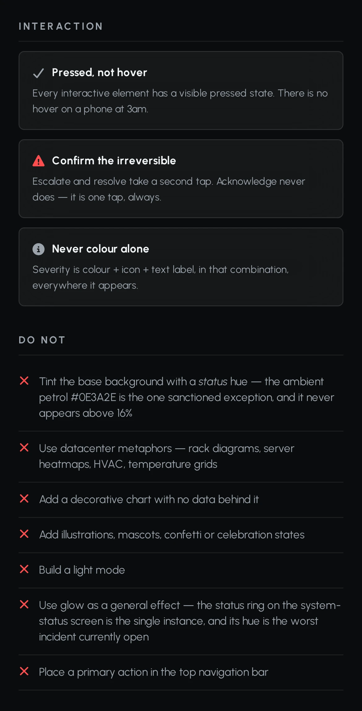
Four rules held across every screen.
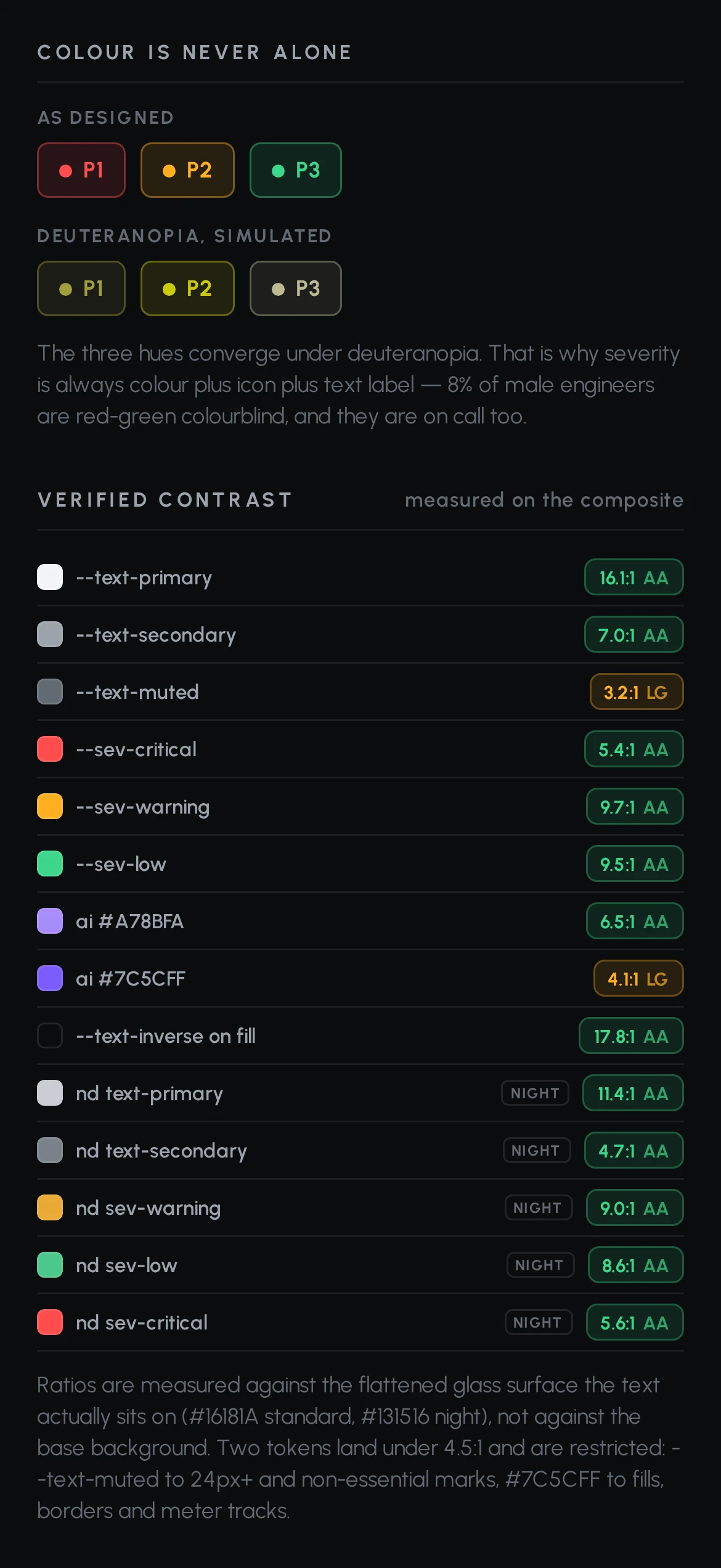
- Colour is never alone. Severity is always colour plus icon plus text label. Rendered under simulated deuteranopia the three severity hues converge almost completely - and roughly 8% of male engineers are red-green colourblind, and they are on call too.
- Contrast is measured on the composite. Every ratio is checked against the flattened glass surface the text actually sits on, not against the base background. Two tokens fell short and were restricted rather than repainted: muted text to 24px and above, and the deep violet to fills and meter tracks, never type.
- Red is spent on one thing. Severity, and nothing else. Offline is neutral. A declined cover request is neutral. Sync failure is neutral. That restraint is what keeps red legible at 3am.
- The thumb defines the layout. Minimum target 48×48, primary actions 56px and full width, everything critical in the bottom third. Nothing important sits in a header that the hand holding the phone cannot reach.
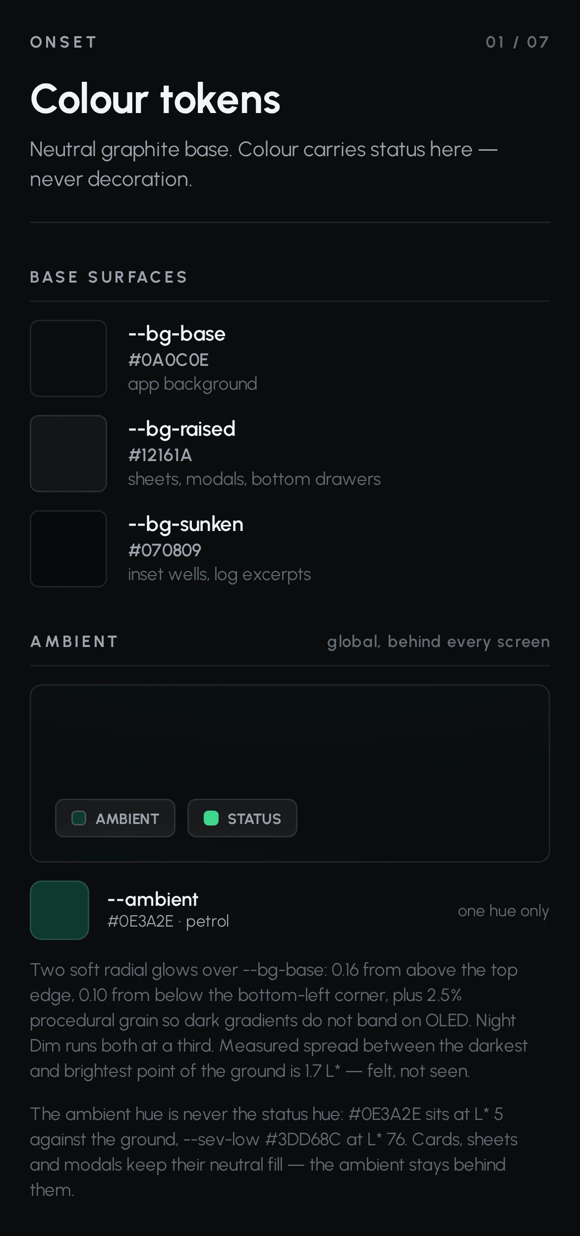
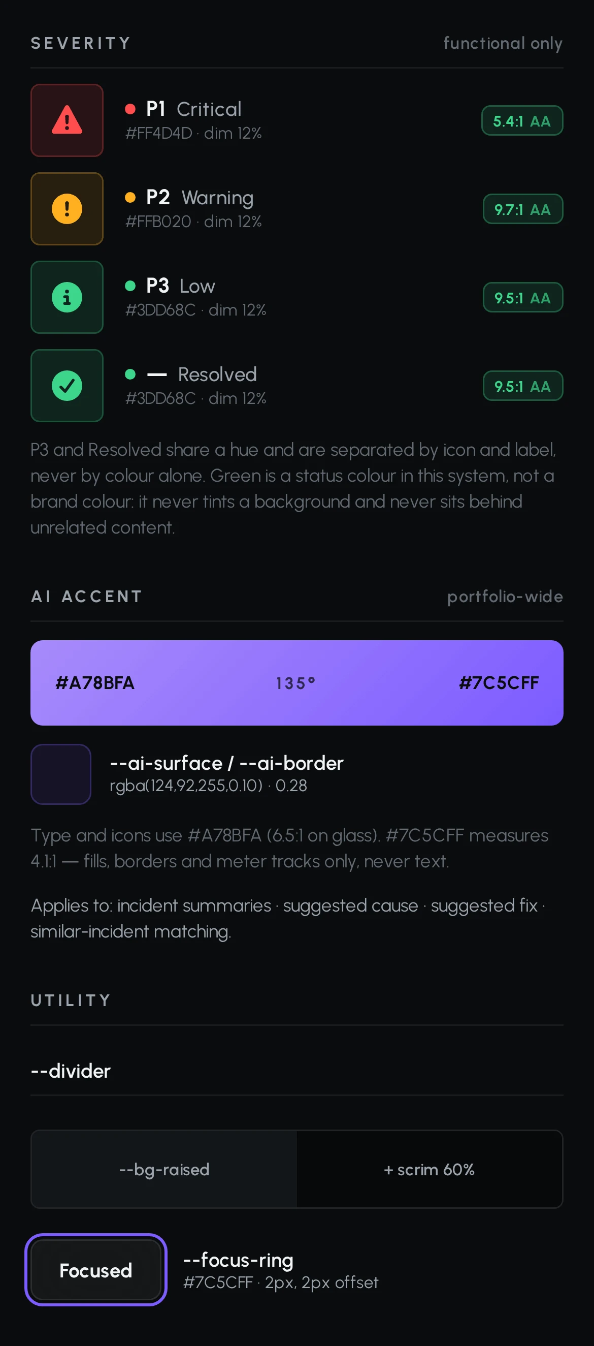
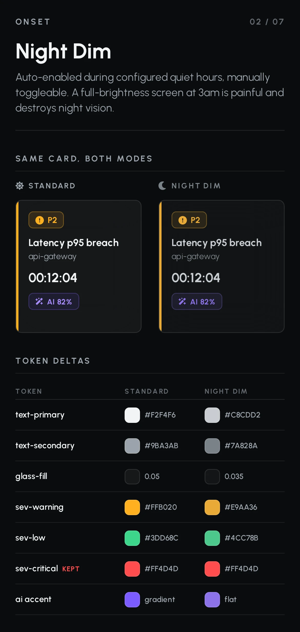
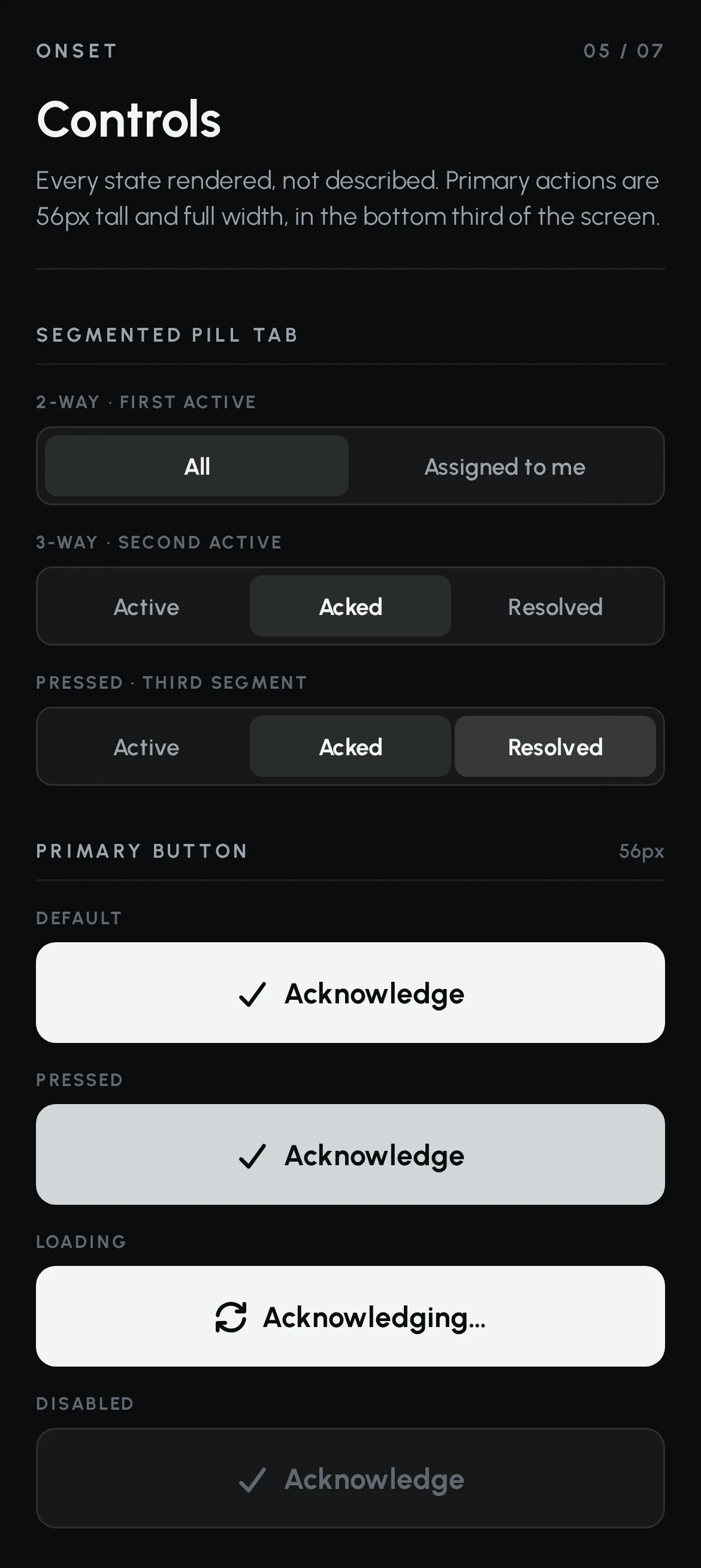
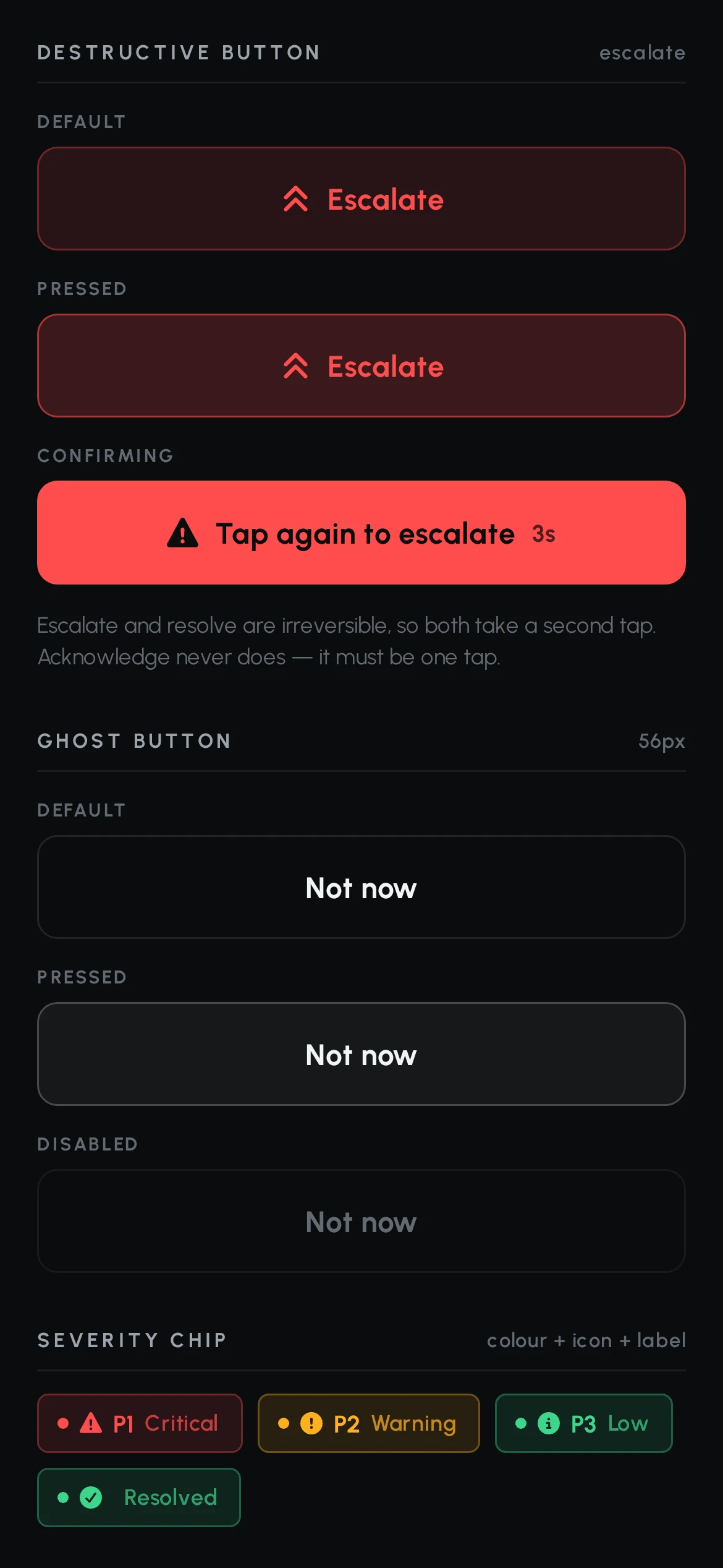
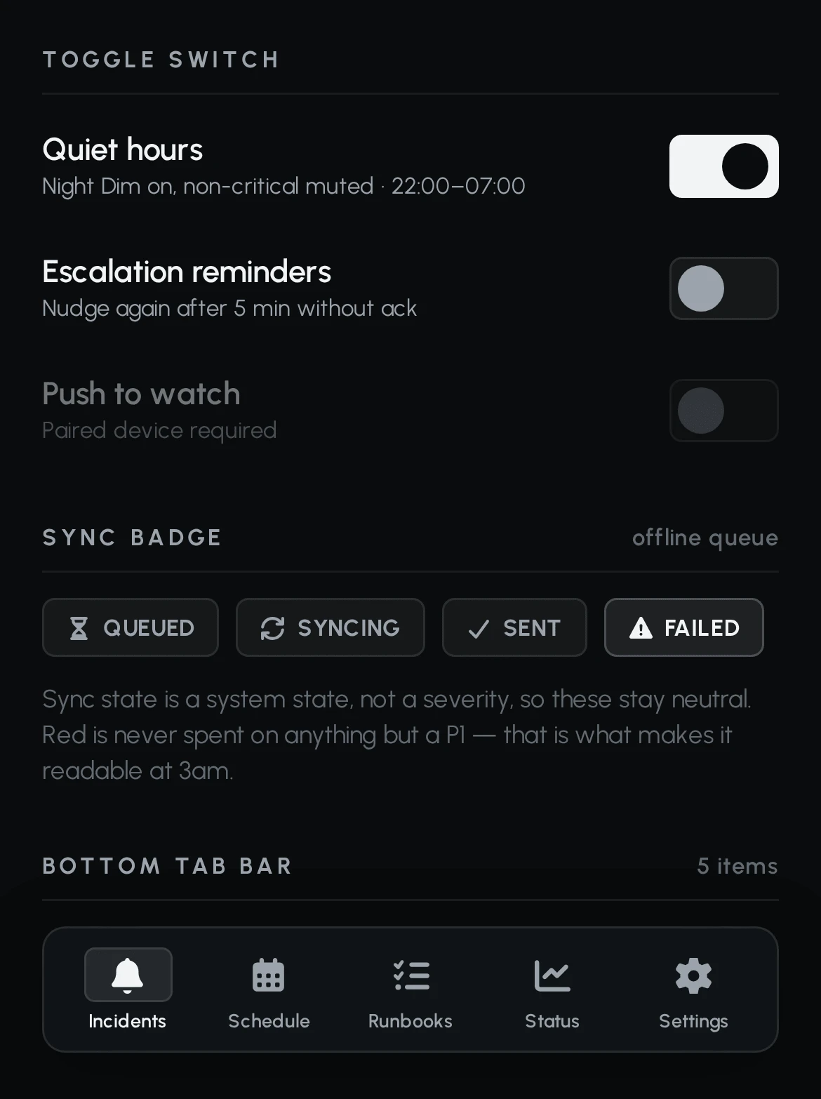
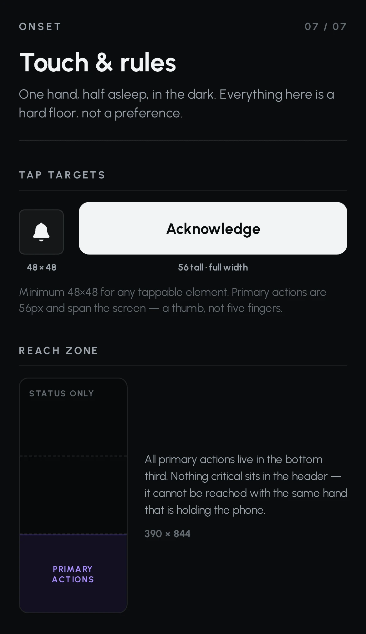
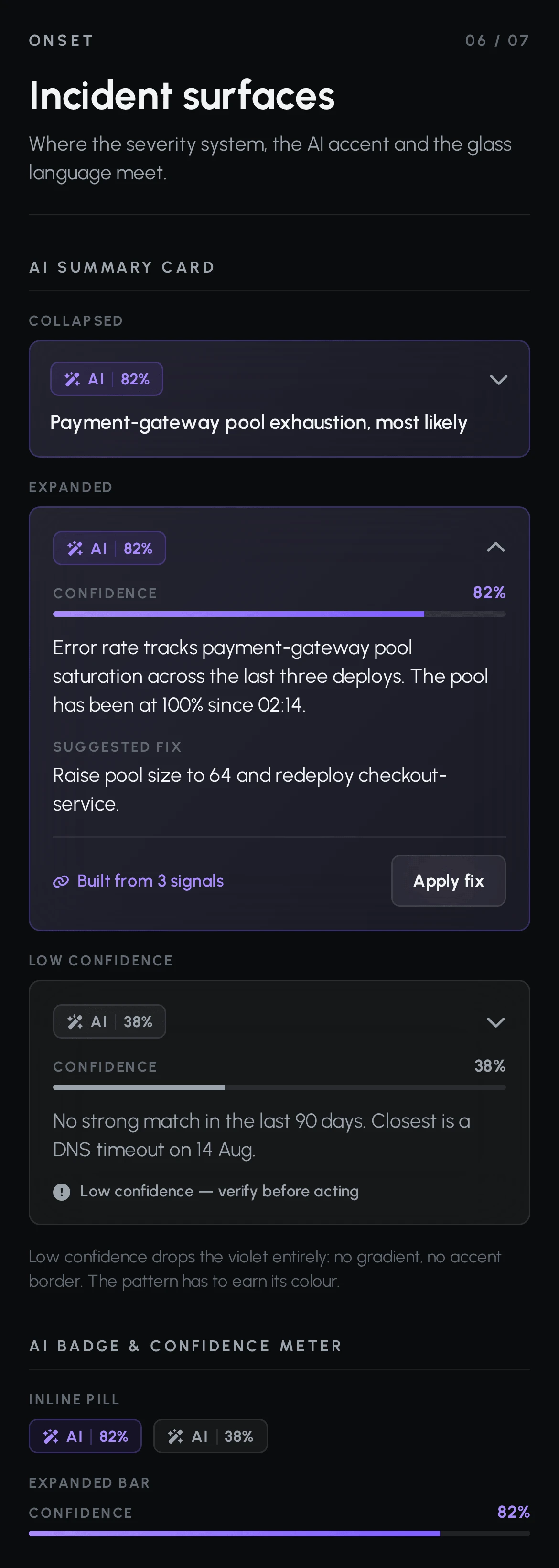
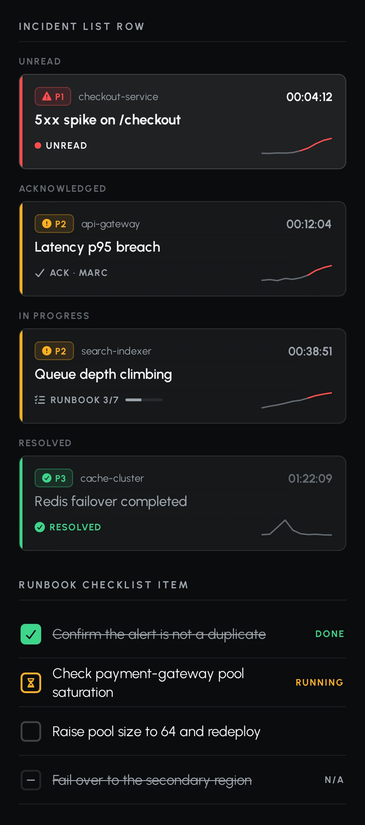
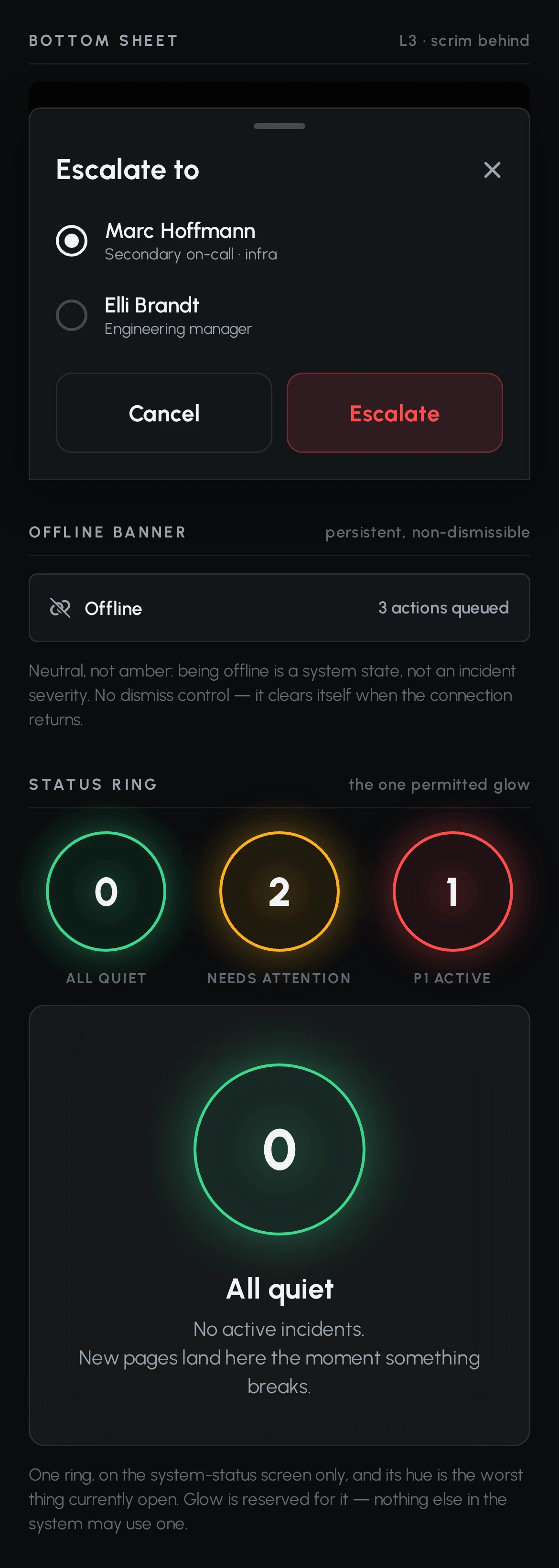
The incident surfaces are where the three layers meet - severity, glass and the AI accent. The AI card is specified at high and low confidence, because the low-confidence state is the one that keeps the high one honest.
04 / THE DECISION
ONE TAP TO ACCEPT.BUT NOT BY ACCIDENT.
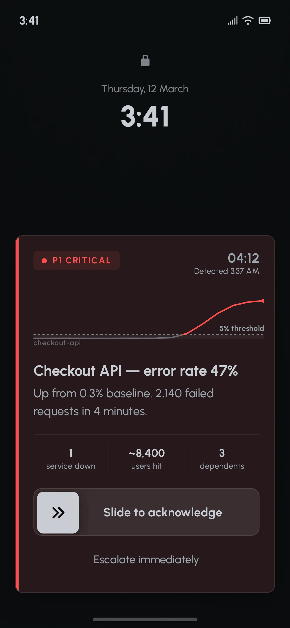
The first screen is not in the app. It is the lock screen, because unlocking a phone is already too many steps.
The alert card occupies the lower two thirds of the screen - the only part a thumb reaches on a phone held in one hand. Above it, the time and date stay untouched, so the first thing the engineer reads is what hour it actually is.
The card carries four facts and nothing else: how severe, what broke, how long it has been broken, and what the metric did. The chart is there instead of an icon because an illustration answers none of those questions.
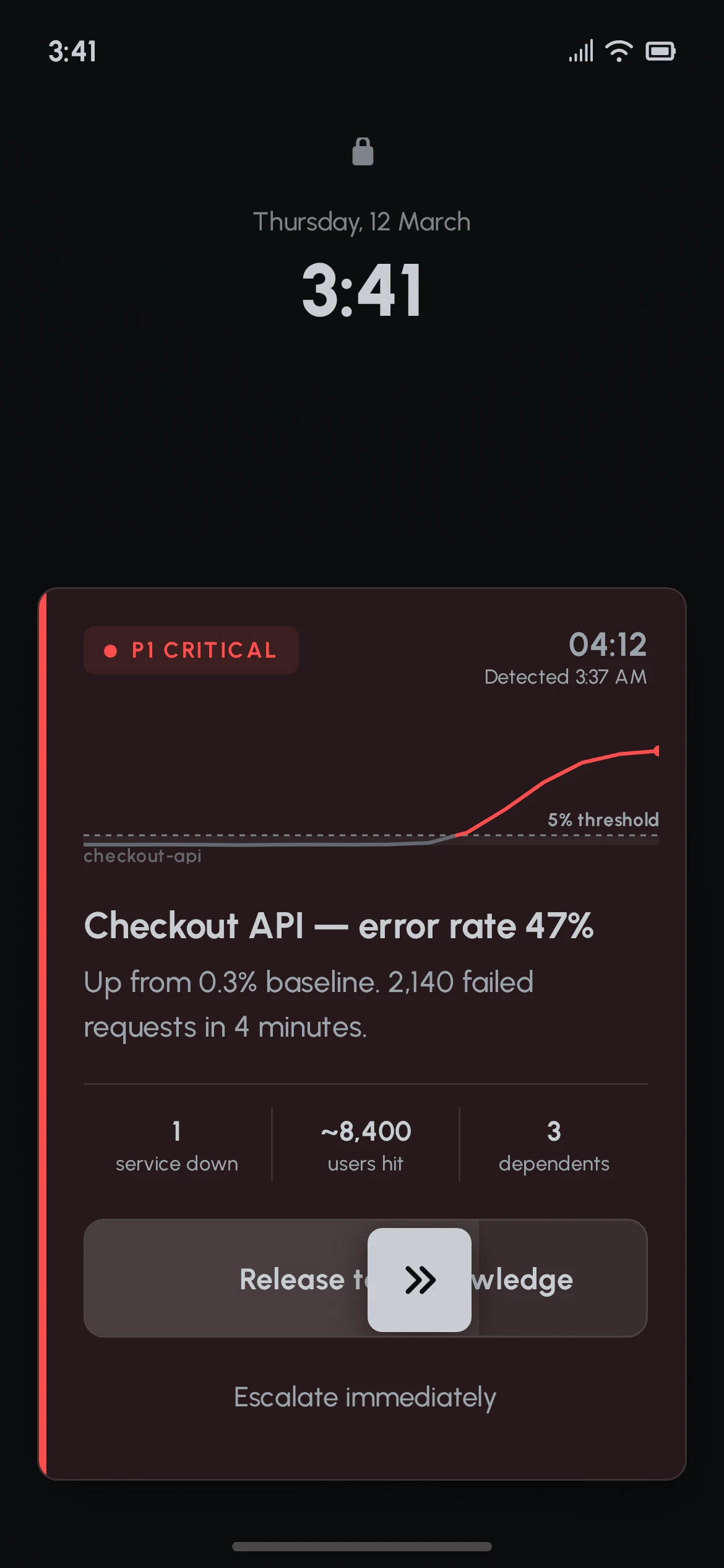
Acknowledging is a slide, not a tap.
A tap can be fired by a cheek, a pocket, or a hand swiping at a nightstand. A false acknowledgement tells the system a human is awake and handling the incident when nobody is - and silences the escalation that would have woken someone else. A slide cannot happen by accident. It is the one place in this product where friction is the feature.
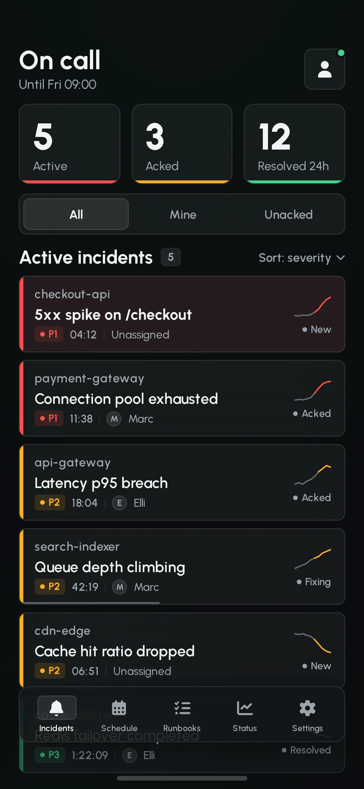
Inside the app, the feed is read by its left edge. Every row carries a 4px severity bar, so the first pass is a vertical rhythm of red, amber and green marks - a shape, not a list. Text is the second pass, for the row that already caught the eye.
Rows are deliberately dense: three lines, ~96px tall, six visible without scrolling. During a bad night an engineer has eight to fourteen open incidents, and a feed that shows three of them at a time has failed at its only job.
05 / AI
THE MODEL READS THE DATA.THE ENGINEER OWNS THE CALL.
An incident generates more signal than anyone can read at 03:40: metrics, logs, deploy history, dependency graphs. Correlating them is exactly what a model is good at, and exactly what a half-awake human is bad at.
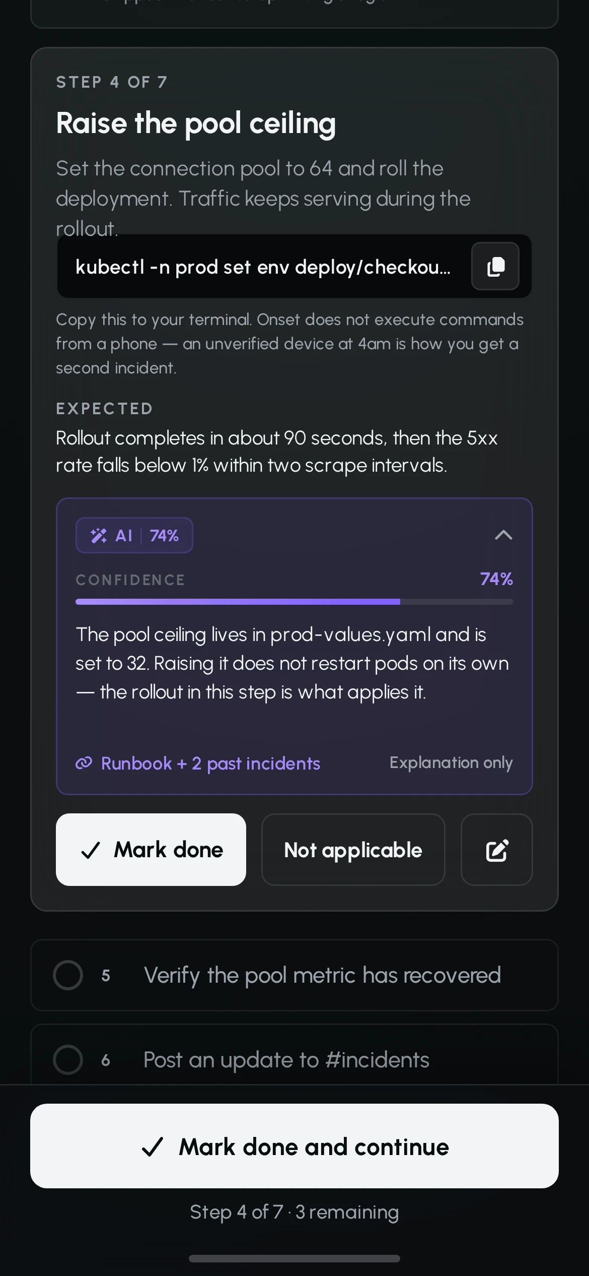
So Onset puts an AI reading on the incident detail screen. It states a likely cause, a suggested fix, and the signals it was built from.
Three rules hold everywhere it appears.
- It is labelled and quantified. Every AI surface carries the violet accent, the word AI, and a confidence value written as text. The colour alone never signals provenance - that would fail the product's own accessibility rules.
- It is traceable. "Built from 3 signals" is a link, not a reassurance. The suggestion can be opened back into the data it came from.
- It never acts. The model drafts, proposes and summarises. Applying a fix, sending a message, acknowledging an incident and completing a runbook step are all human taps, always.
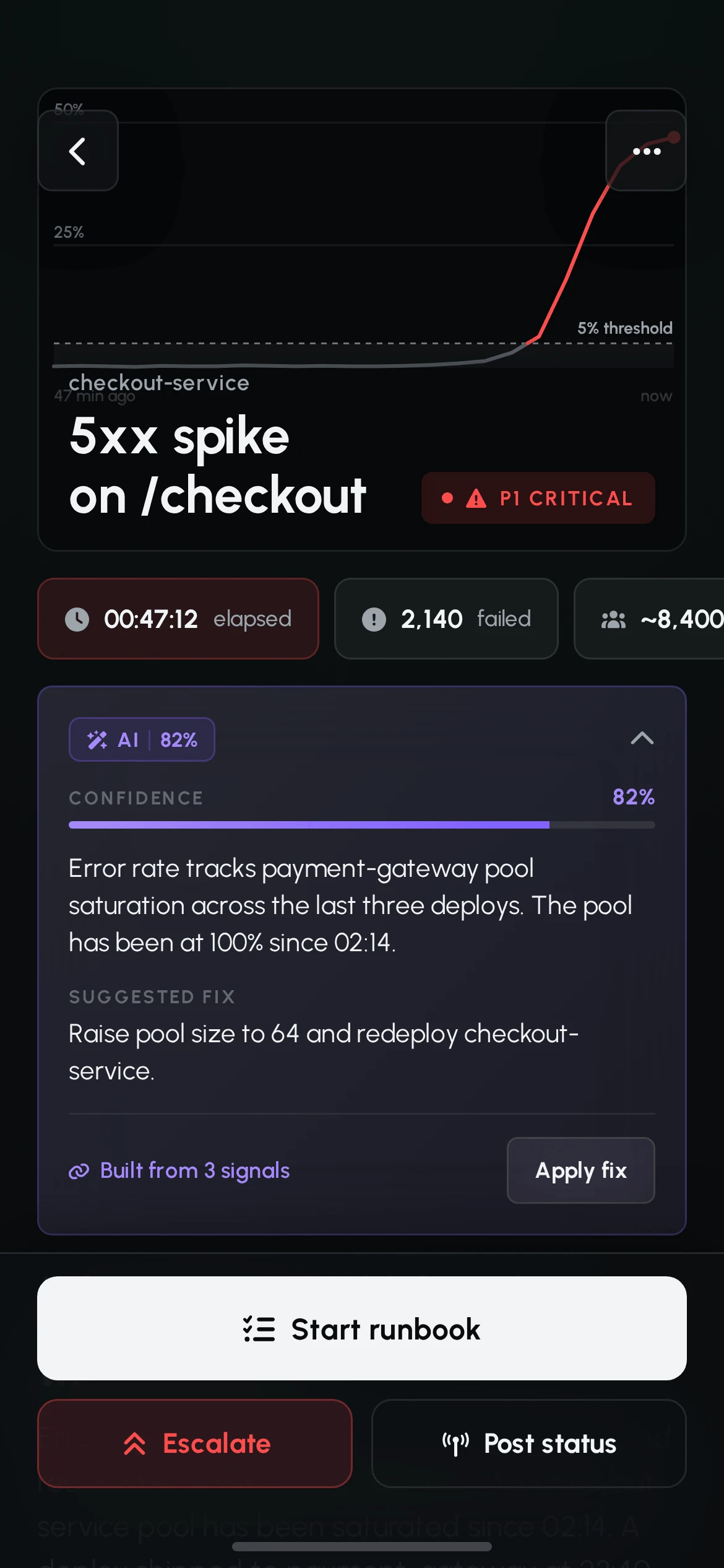
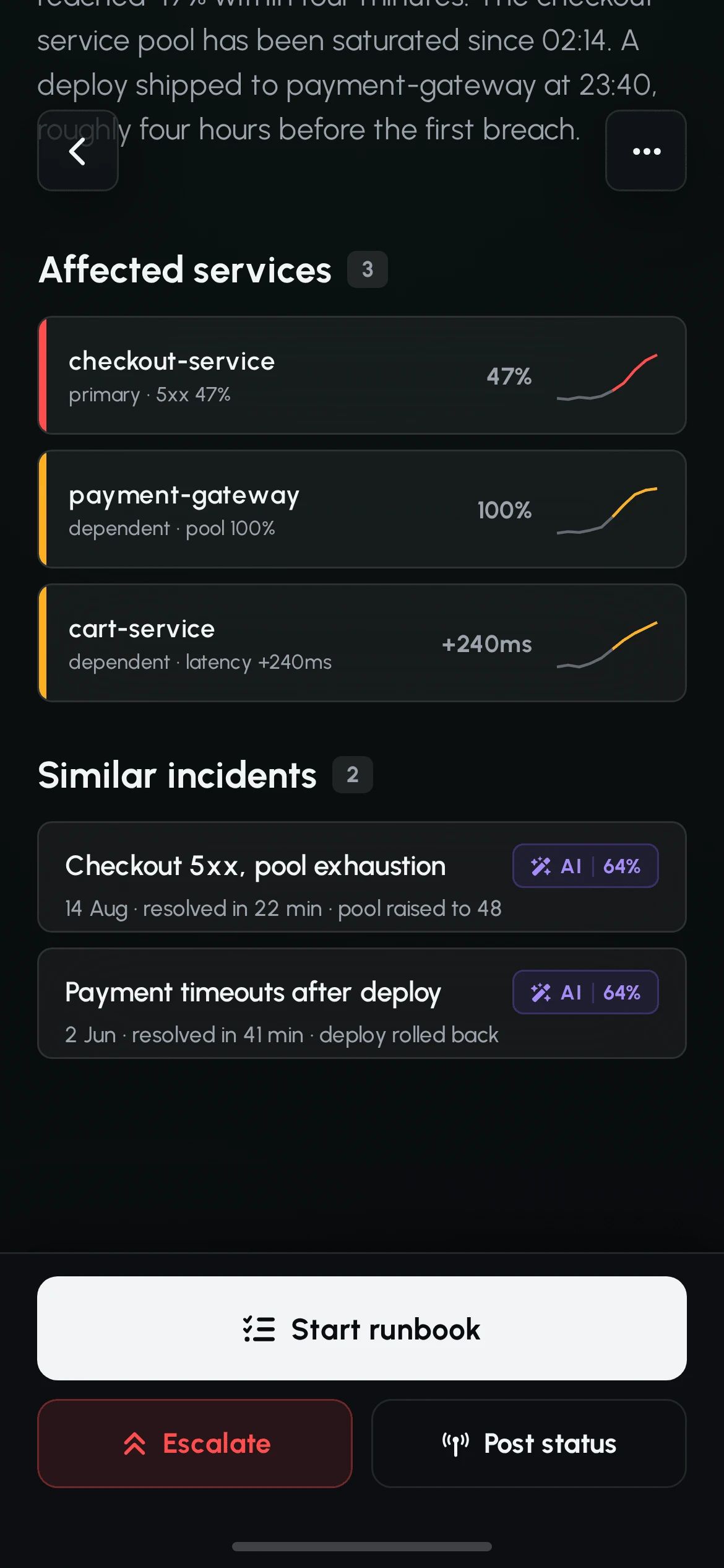
Facts and inference are also kept physically apart on the screen. A plain prose block states what is known - thresholds, timings, the deploy four hours earlier - with no interpretation in it. The interpretation sits above, inside a card that announces itself as a model output.
The same card also knows when to step back. When the model has nothing, it says so. Below 50% confidence the card drops the violet entirely - no gradient, no accent border - and reads "no strong match in the last 90 days". The accent is earned by confidence, not granted by category.
A model that is confident about everything is a model nobody checks.
06 / THE RECORD
EVERY DECISIONHAS AN AUTHOR.
Two days after the incident there is a postmortem. Two hours into it, someone new is pulled in and asks the only question that matters: what has already been tried?
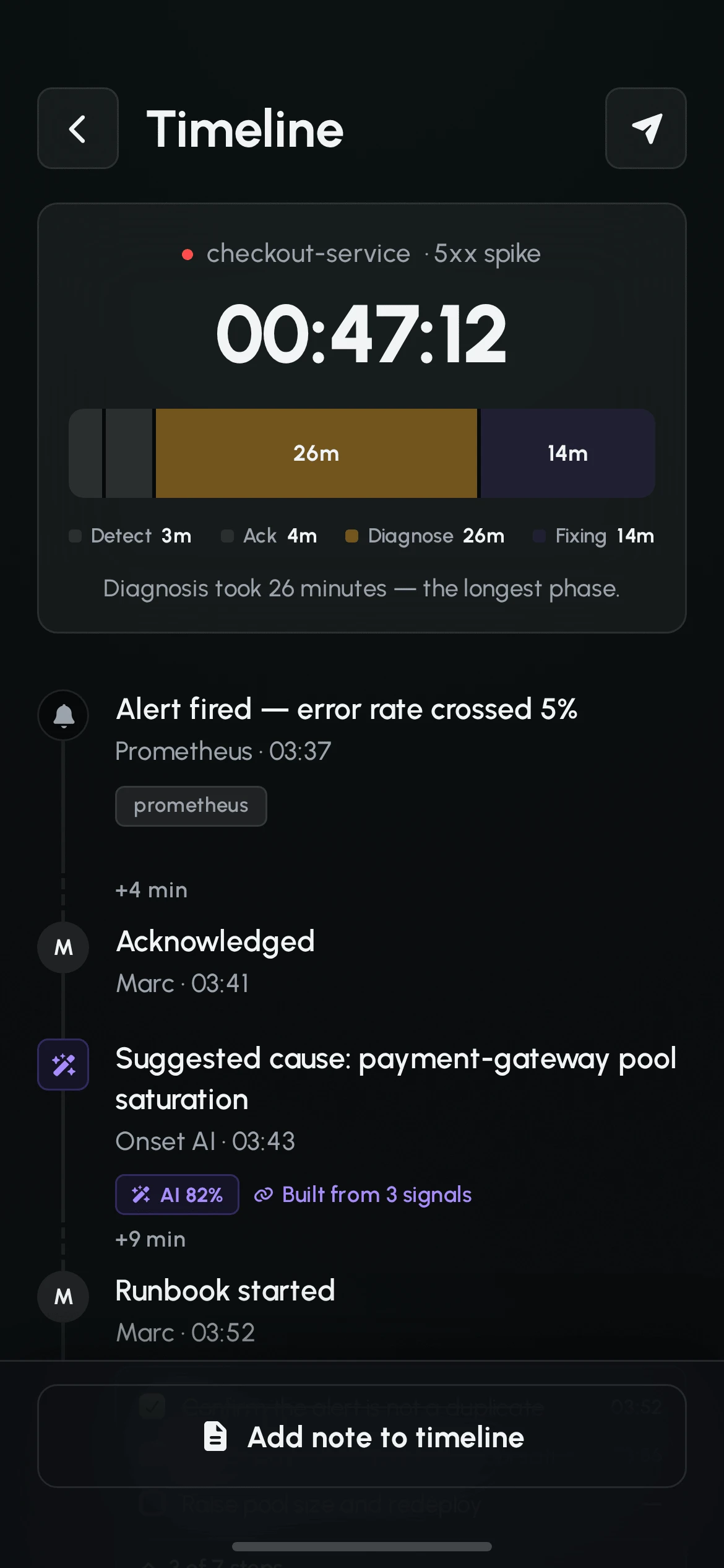
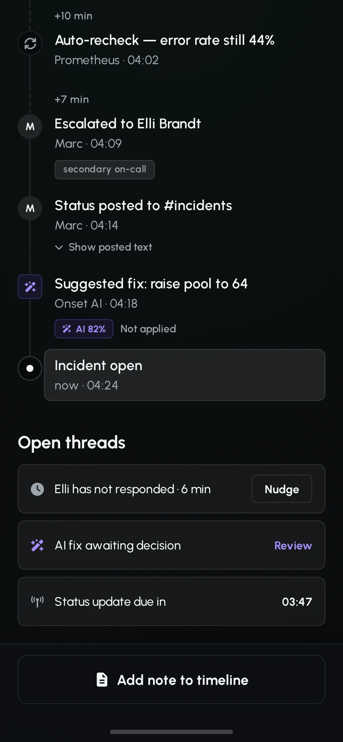
The timeline answers both. It is the live "what's been done" during the incident and the record afterwards, and it is the same screen.
Entries come in three visually distinct node types - a system event, a human action, and an AI suggestion. A circle with a monochrome icon, a circle with a face, and a violet rounded square. Scanning the line tells you which decisions a person made and which a machine proposed, before reading a word.
Timestamps are absolute, not relative. And gaps are shown, not smoothed: wherever more than five minutes passed between two entries the line breaks and labels the silence. Empty time is usually the finding.
Above the timeline, a phase bar splits the elapsed time into detect, acknowledge, diagnose and fix, with the longest phase named in a sentence. The postmortem's first question is answered before anyone asks it.
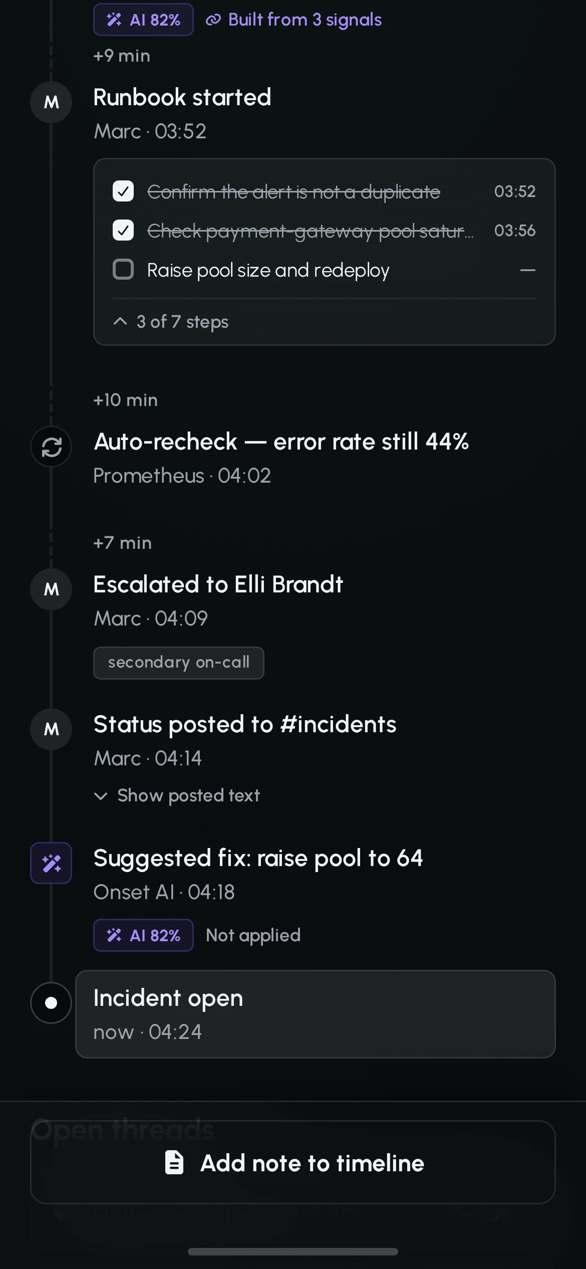
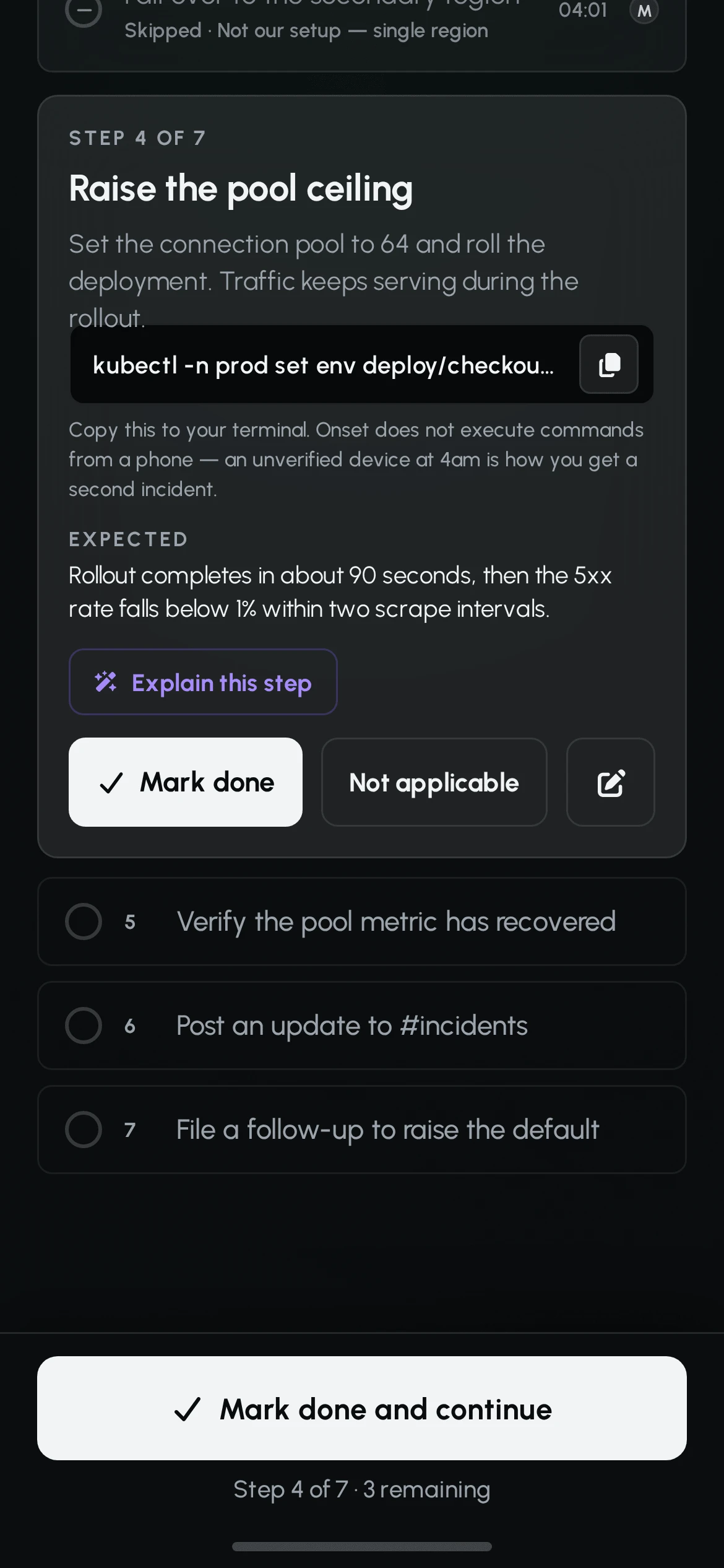
The runbook is the same principle applied to procedure. One step is open at a time; completed steps collapse, upcoming steps stay quiet. Commands can be copied but not executed - running infrastructure commands from an unverified phone at 4am creates the second incident, and the interface says so rather than hiding the capability.
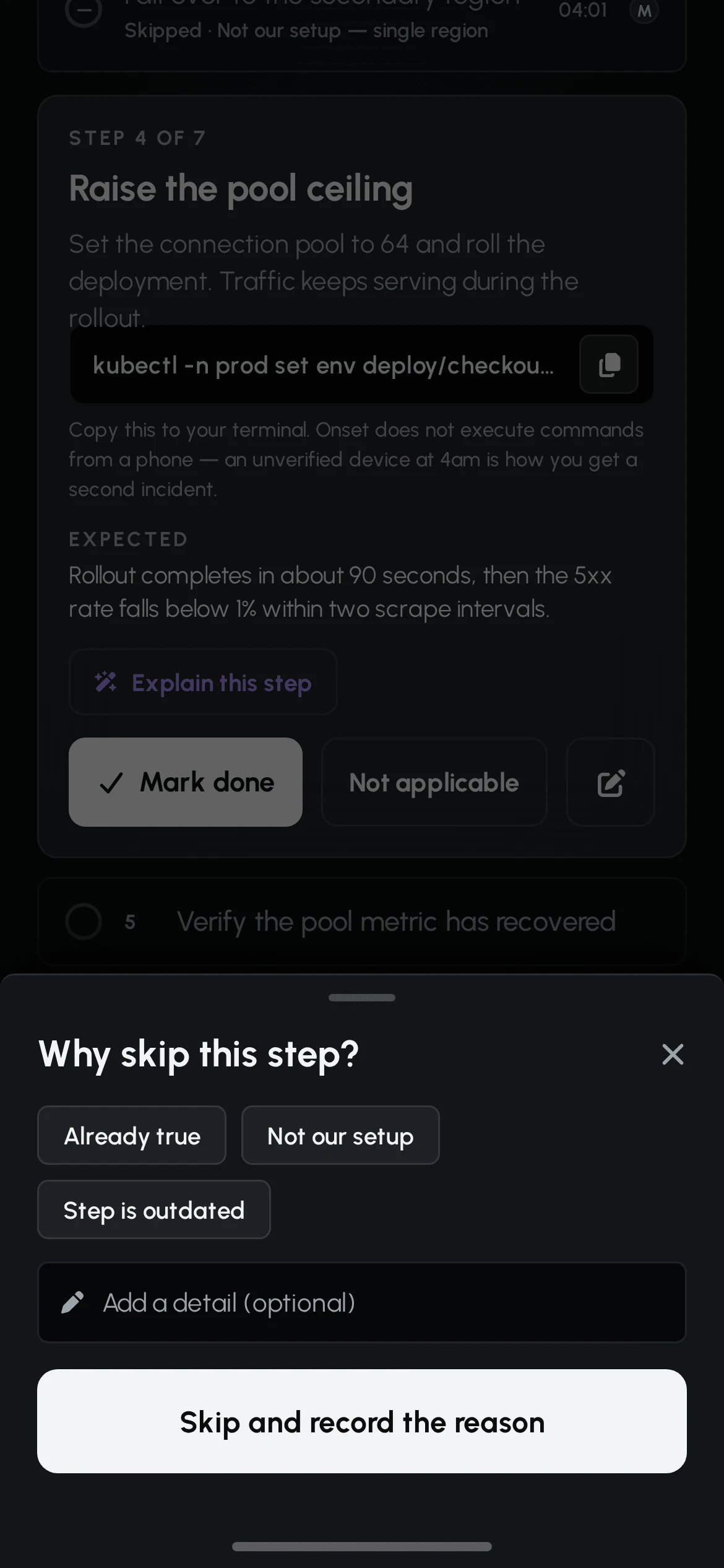
The step that mattered most to design was the one nobody builds: "not applicable".
Runbooks are written for the general case and a real incident rarely matches it. Without an honest way to skip, people either tick a box for work they didn't do or abandon the runbook entirely. In Onset a skip requires one line of reason, renders with a dash rather than a green check, and is routed to the runbook's owner. A skipped step is how a runbook gets fixed.
07 / COMMUNICATION
TWO AUDIENCES.ONE OF THEM CAN'T BE UNTOLD.
Thirty-four colleagues and an unknown number of customers are waiting to hear something. The engineer has about forty seconds and no capacity to compose careful prose.
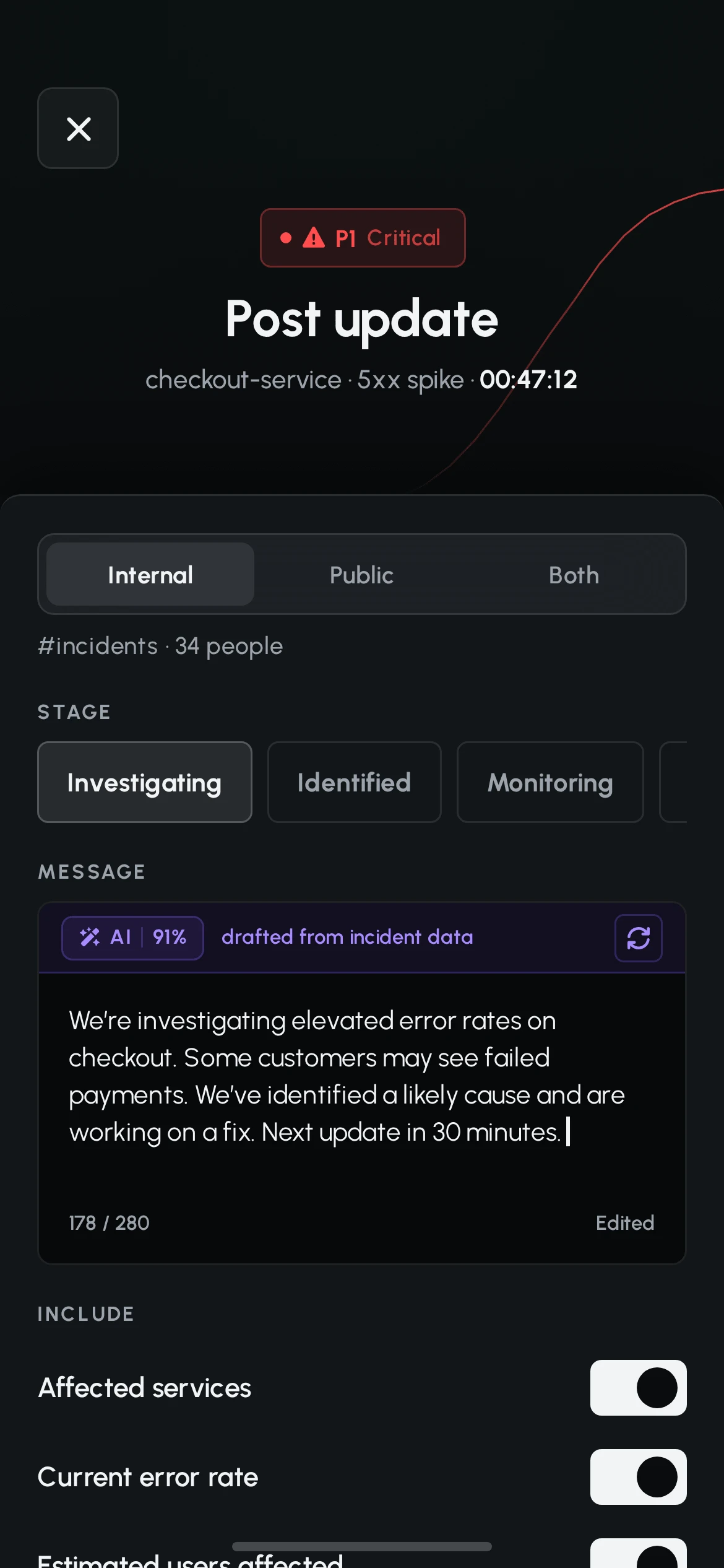
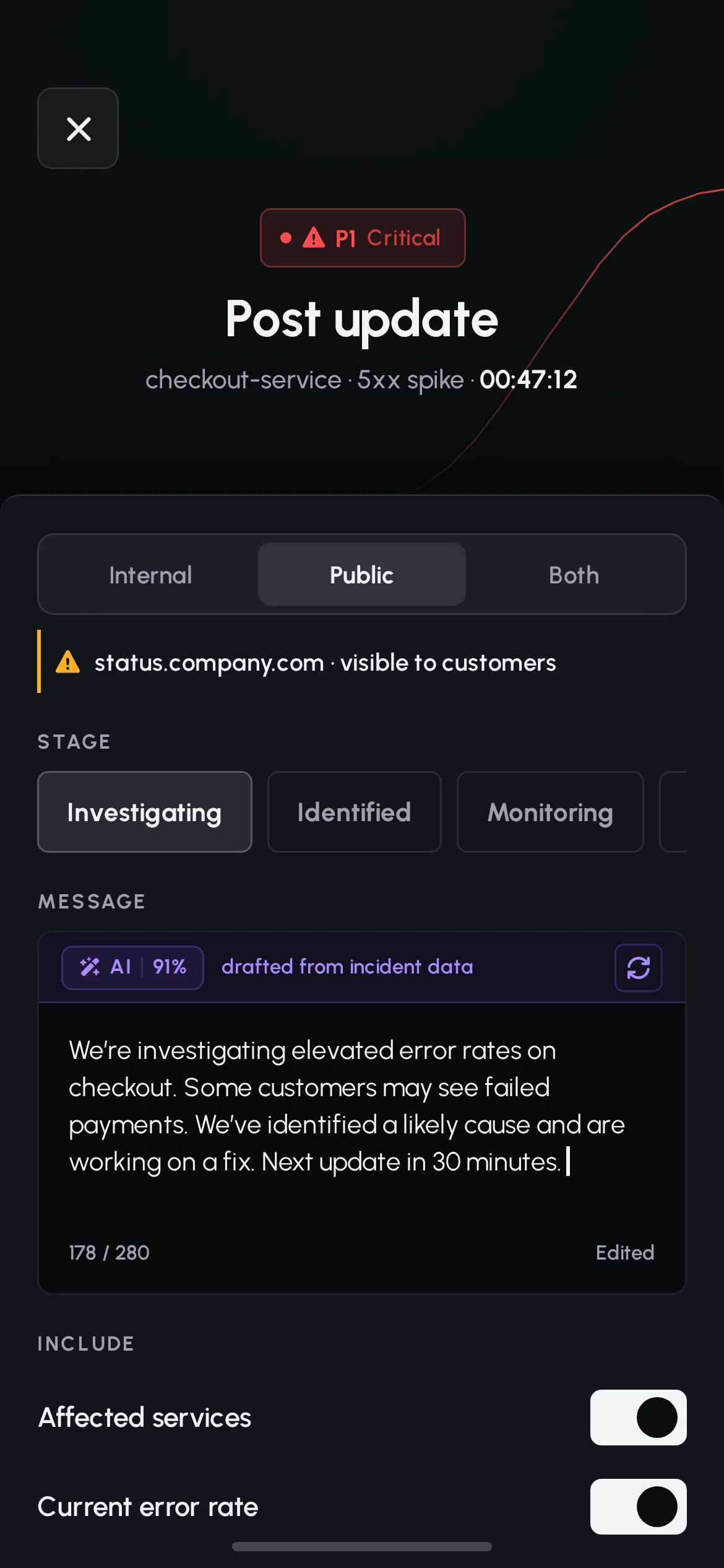
The composer never starts empty. A draft is generated from the incident data and is plainly editable, with the AI strip visually separated from the text it produced. The model solves the blank page; the engineer owns the words.
The screen's real work is the distinction between the two audiences. Selecting "Public" changes three things at once: a warning rule appears on the destination line, the "estimated users affected" toggle switches itself off, and the send button requires a second tap inside a three-second window.
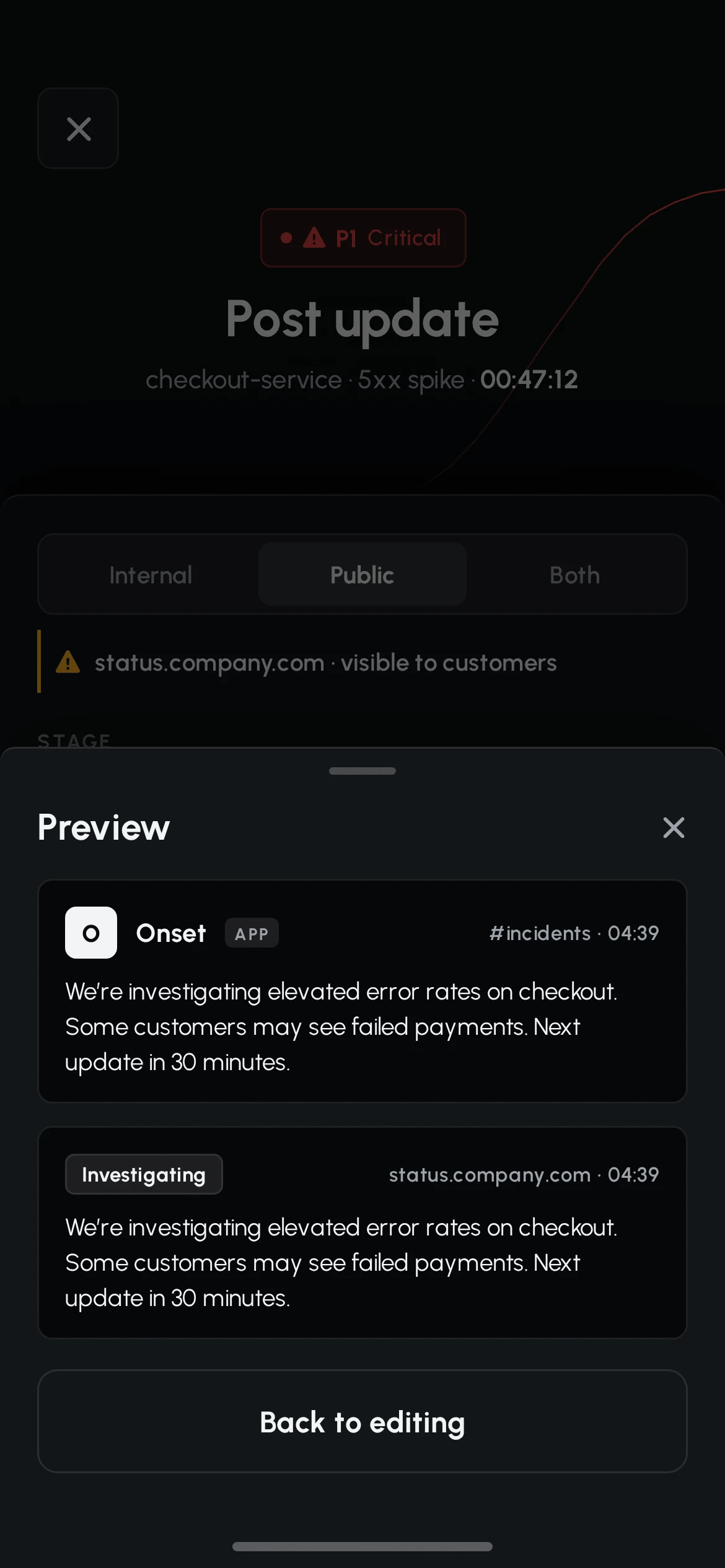
Before any of that, the preview renders the same source text twice - once as a Slack message, once as a status-page entry - because an update that reads fine internally can read very differently to a customer.
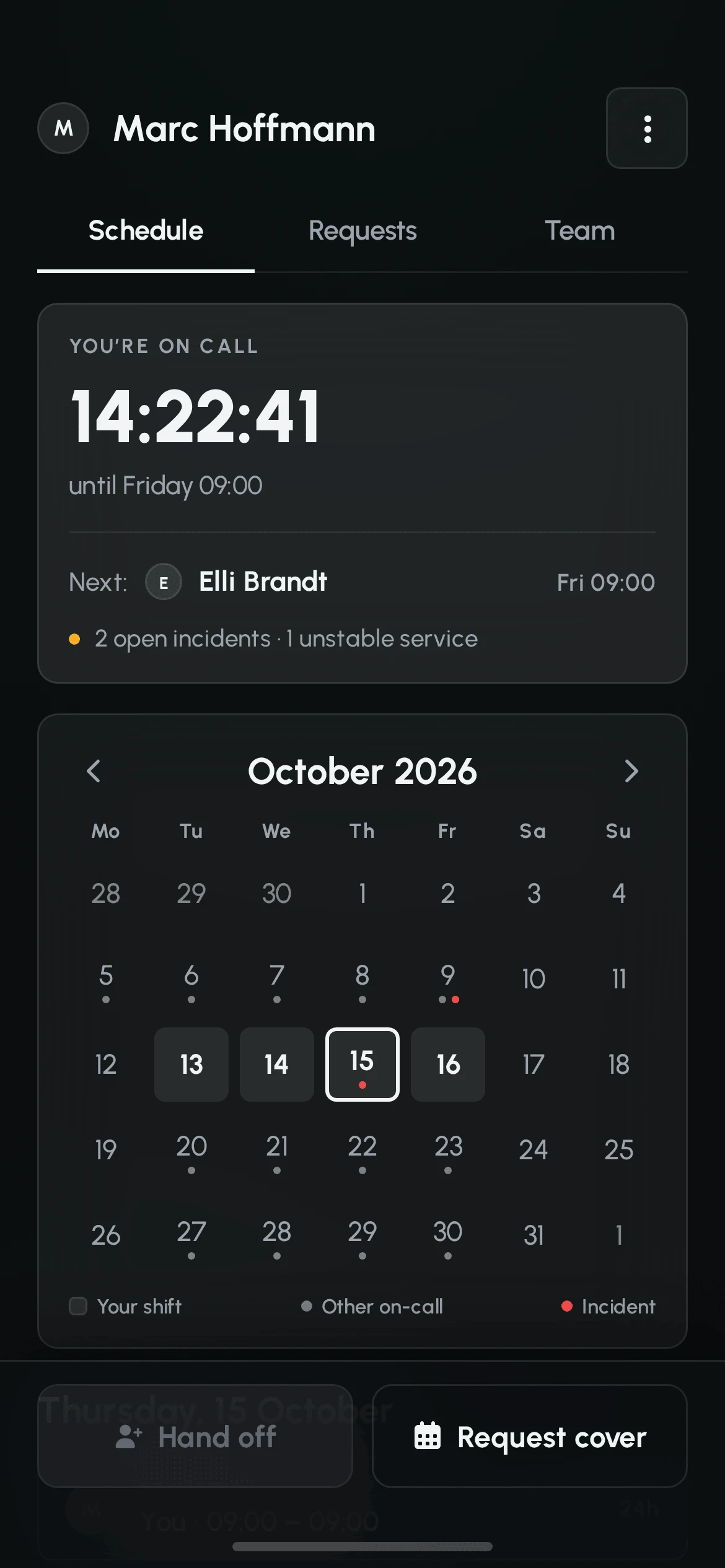
The last communication is the one most often skipped. At 09:00 the shift changes, and an unspoken handoff is how a twenty-minute incident becomes a two-hour one.
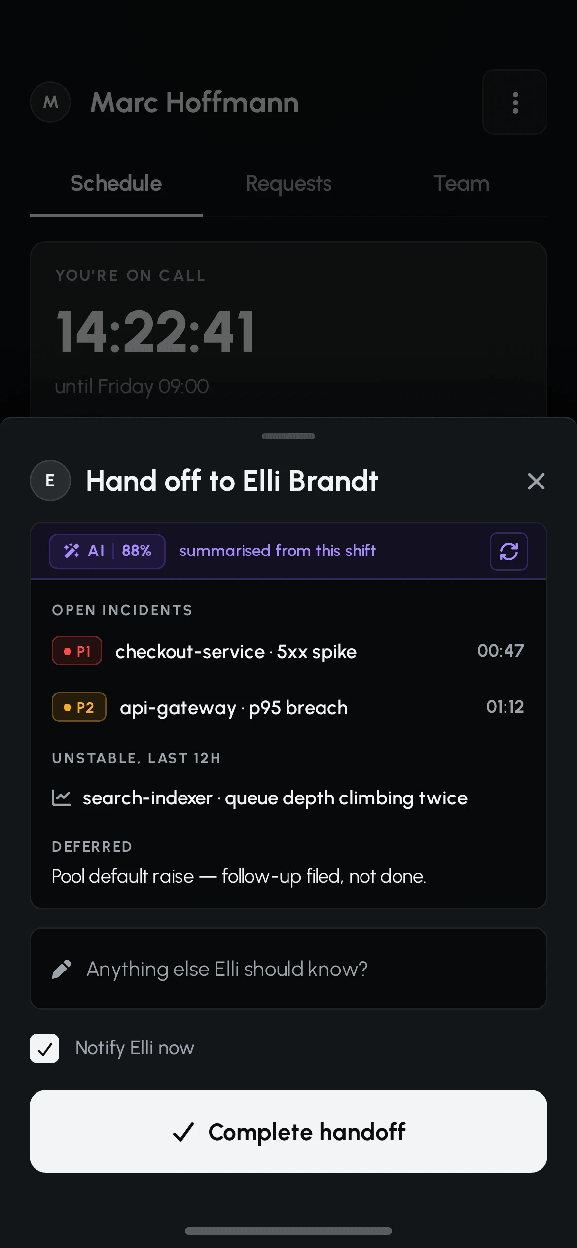
The handoff sheet is pre-filled from the shift itself - open incidents, services that went unstable, anything deferred - and asks for the one thing the data cannot supply: anything else the next person should know.
08 / OFFLINE
THE NETWORK IS THE ONE THINGON-CALL CAN'T ASSUME.
A datacenter basement, a train, a rural house at 3am. Offline is not an edge case in this product - it is a Tuesday.
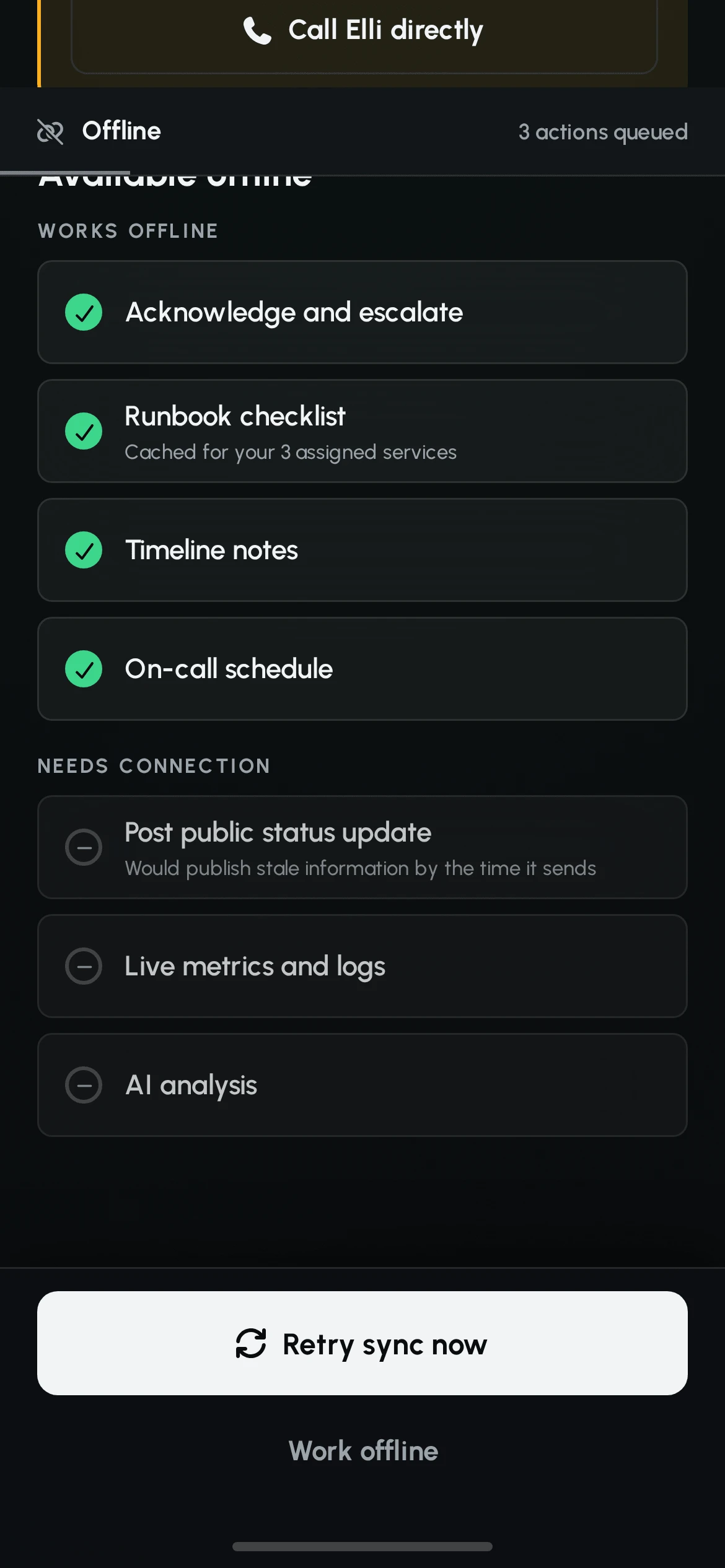
Most of the app keeps working. Acknowledge, escalate, the cached runbooks for the engineer's own services, timeline notes and the schedule all queue locally and send when the connection returns.
Three decisions make that queue honest rather than reassuring.
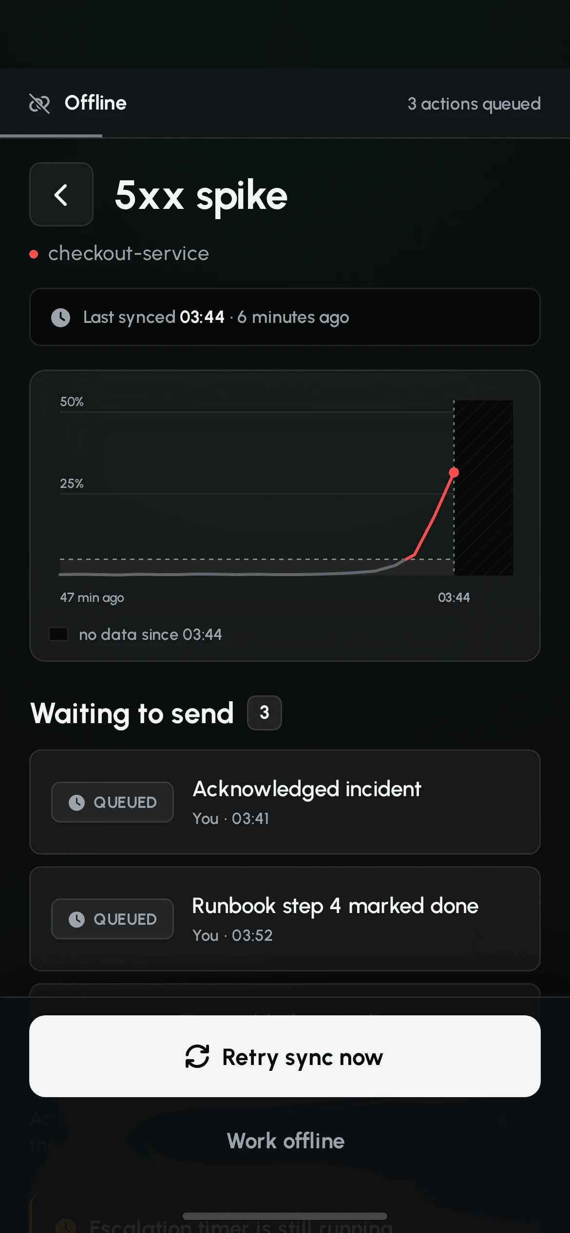
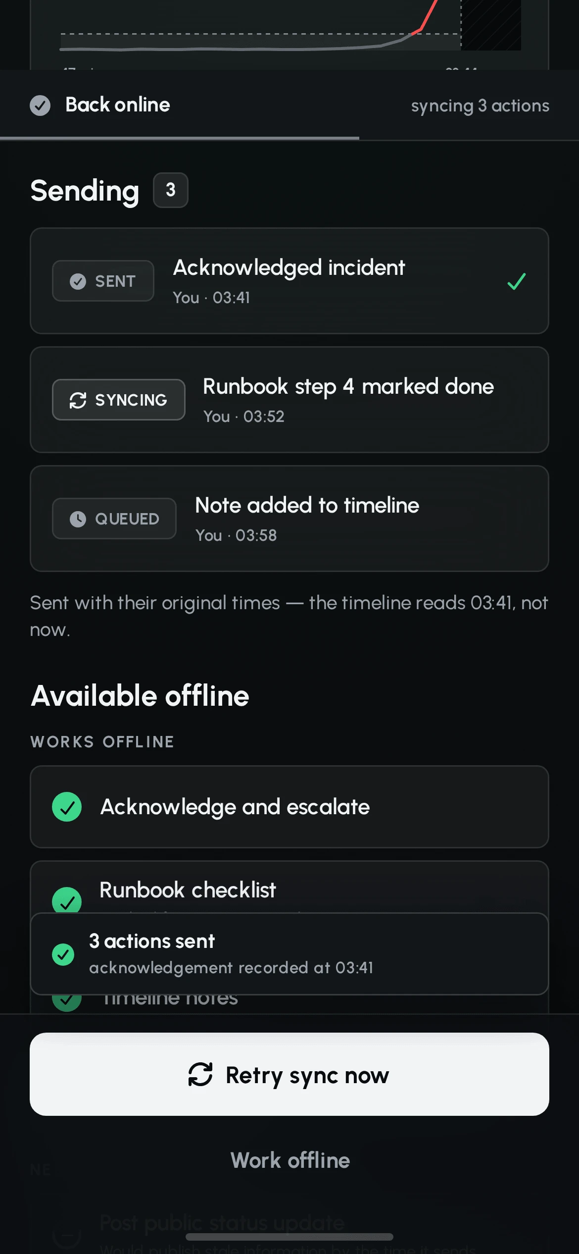
- Actions keep the time they were performed. A postmortem that shows an acknowledgement at 04:02 instead of 03:41 tells a false story about response time, and the engineer is the one who pays for it.
- Stale data is marked as stale. The chart stops at the last synced point and the remaining width is hatched and labelled. A flat line would read as recovery.
- The escalation timer keeps running, and the screen says so. The most dangerous offline failure is an engineer who believes they have taken the incident while the system does not know it. A warning card counts down to the moment the secondary on-call is alerted, and offers the one path that needs no data - a phone call.
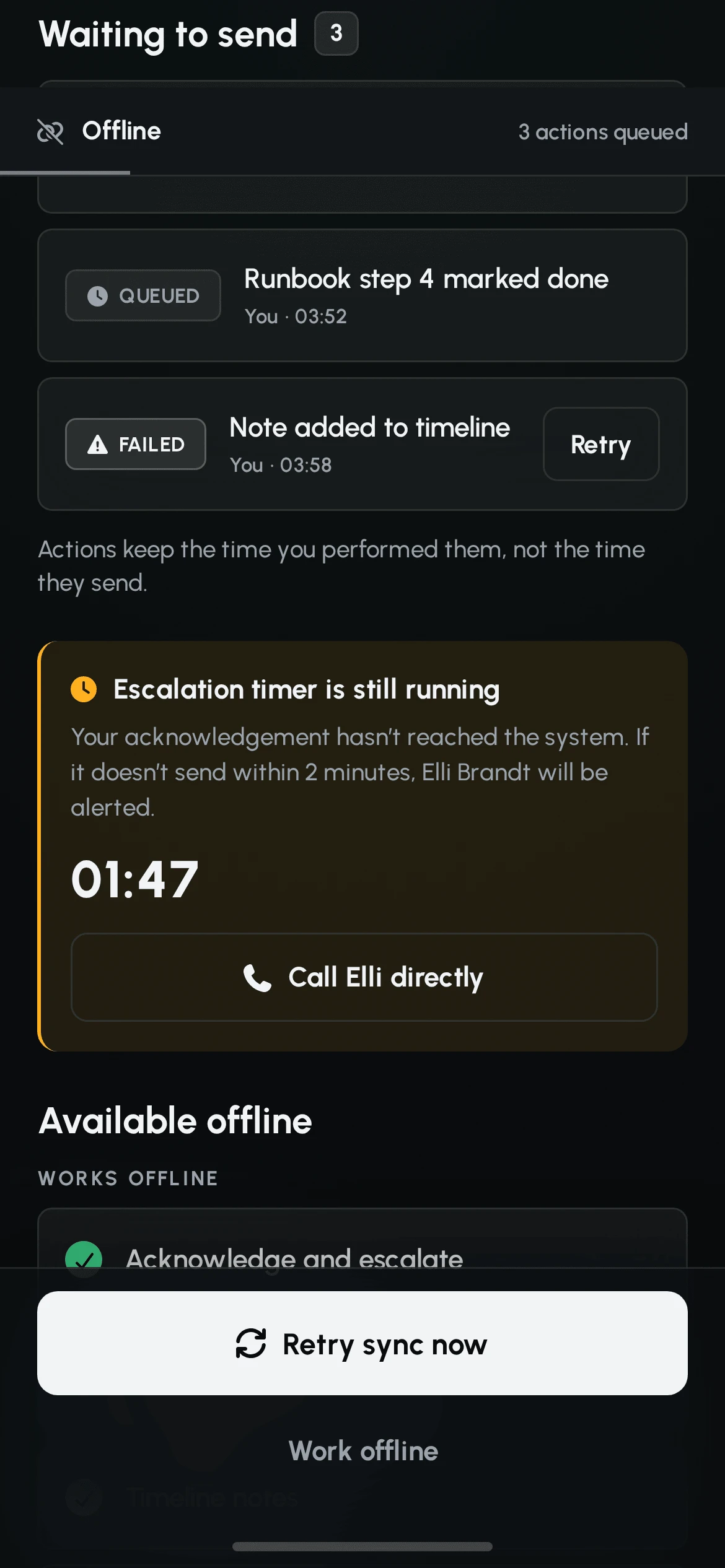
One action is deliberately blocked rather than queued. A public status update that sends minutes later, stamped with the send time, publishes stale information to customers - worse than publishing nothing. Internal actions queue; external ones wait for a human to reconfirm.
09 / RESTING STATE
MOST OF THE WEEKNOTHING IS ON FIRE.
Between incidents the app has two jobs: say truthfully that nothing is wrong, and let the engineer decide what is allowed to wake them.
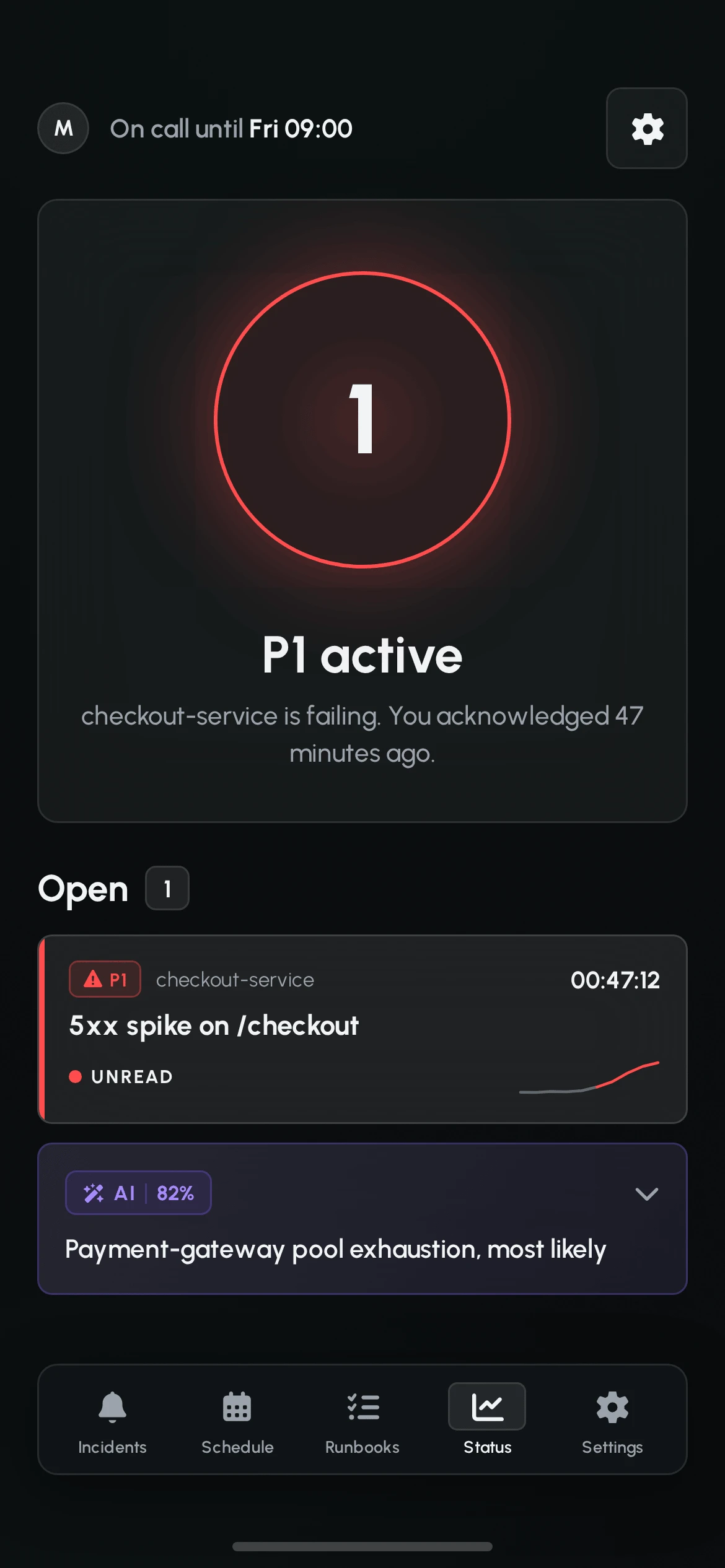
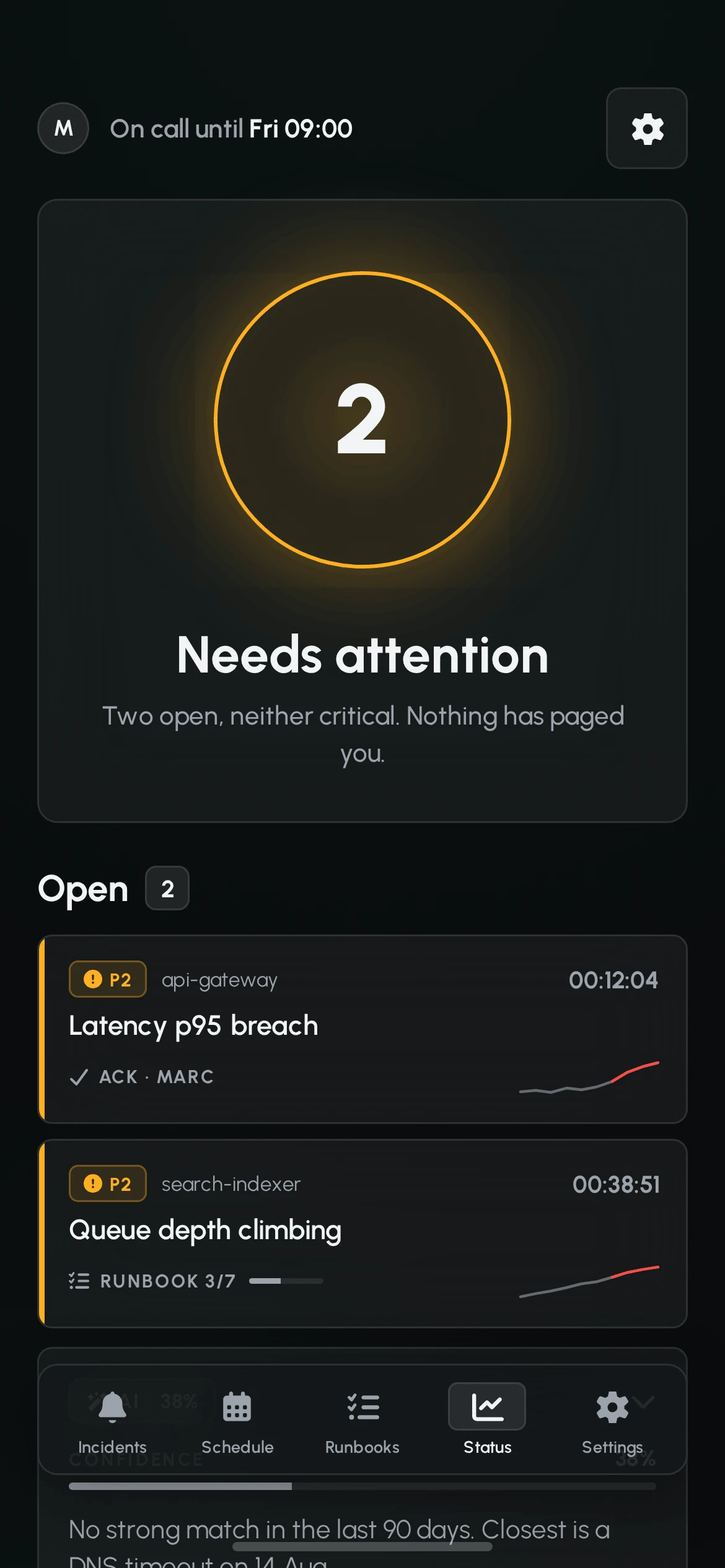
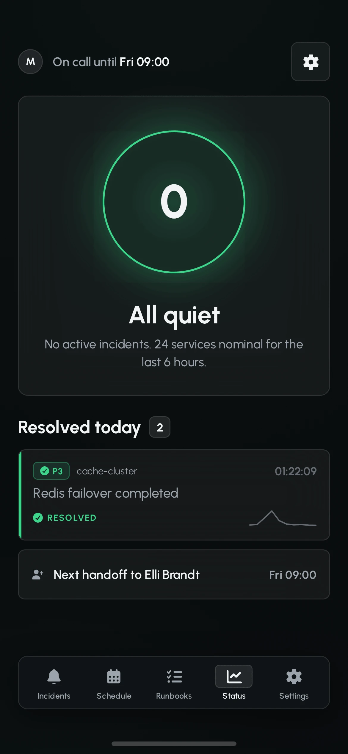
The status screen is the product's resting state, and the only place a glow is permitted. The ring is a dial, not decoration: it carries the count of what is open and takes its colour from the highest severity in it. Green with a zero in the middle is semantically honest - nothing is on fire.
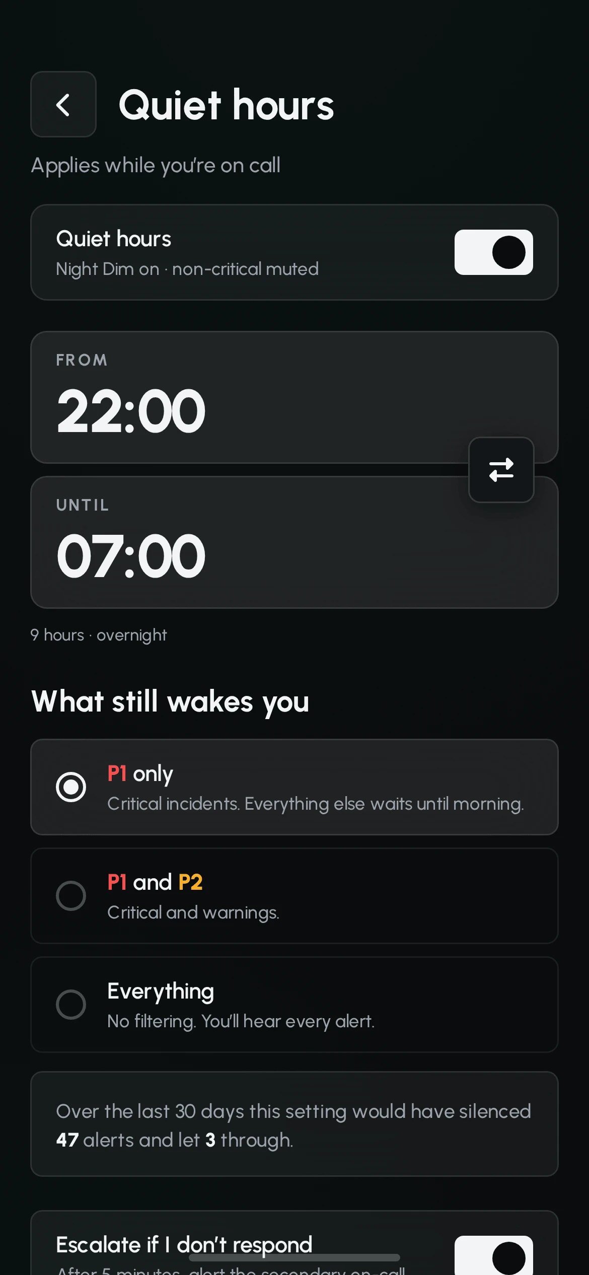

Quiet hours are the screen where the trade is made explicit. The engineer is not switching off notifications, they are choosing a threshold - and the interface prints the consequence: over the last 30 days this setting would have silenced 47 alerts and let 3 through. A setting that hides its odds is a setting people turn off entirely.
10 / WHAT WAS TESTED
NO USERS.SAY SO PLAINLY.
This case study has no usability test behind it, and inventing one would be the easiest lie in a portfolio. What it has instead is a teardown of five competitors, a heuristic evaluation against Nielsen's ten, and a set of measured contrast ratios.
Heuristic findings that changed the design
| Heuristic | Finding and change |
|---|---|
| Visibility of system status | An offline acknowledgement looked identical to a confirmed one. Added the escalation countdown card and the "performed at" timestamp on queued actions. |
| Error prevention | Tap-to-acknowledge could fire in a pocket. Replaced with a slide gesture. |
| Match with the real world | The runbook had no way to say "this step doesn't apply here". Added skip-with-reason as a first-class state, routed to the runbook owner. |
| User control and freedom | A public status update could not be recalled. Added the dual preview and a second-tap confirm. |
| Aesthetic and minimalist | The first lock-screen build tinted the entire card red. Squinting at it from across the room showed one red rectangle and no hierarchy. Red was cut to an 8% tint plus the severity bar, and the acknowledge control was made the only light element on the card. |
Verified contrast · measured on the flattened glass surface
| Token | Standard | Night Dim |
|---|---|---|
| Primary text | 16.1:1 | 11.4:1 |
| Secondary text | 7.0:1 | 4.7:1 |
| P1 critical | 5.4:1 | 5.6:1 |
| P2 warning | 9.7:1 | 9.0:1 |
| P3 low | 9.5:1 | 8.6:1 |
| AI accent (type) | 6.5:1 | 4.9:1 |
Two tokens land below 4.5:1 and are documented as restricted rather than quietly used: muted text at 3.2:1 is limited to 24px and above and to non-essential marks, and the deep violet at 4.1:1 is limited to fills, borders and meter tracks. Publishing the failures next to the passes is the part that makes the table worth anything.
11 / LIMITS
WHAT THIS IS,AND WHAT IT ISN'T.
This is a self-initiated concept project, not a shipped product. No customer, no production data, no on-call rotation that actually paged anyone.
What that means in practice:
- Nobody was woken at 3am to test it. Every claim about the 03:40 state comes from public postmortems, competitor teardown and reasoning - not from observation. A real evaluation of this product would have to be run at night, on tired people, and that is the study this case study is missing.
- One role is designed for. The responder. An incident commander coordinating several people, an engineering manager watching from outside, and the support team fielding customer questions all have a claim on this product and none of them are designed for.
- Runbook authoring is out of scope. Onset executes runbooks; it does not help anyone write or maintain one - which is where most of the real failure lives.
- Alert routing and escalation policy are assumed. The rules that decide who gets paged in the first place are configured elsewhere, on a web product this case study does not cover.
- The system contradicted itself twice, and both are documented. The ambient background used green while the system forbade tinting the base with a status hue; it was resolved by giving the ambient its own deep petrol token at a separate hue, not by ignoring the rule. The status ring glows in three colours while the system permits one glow - resolved by reclassifying it from an empty-state decoration to a status dial. A system that never needs amending was never used.
Next: the incident commander view, and the authoring side of runbooks.
12 / THE FLOW
ALERT. DECIDE.WORK. HAND OVER.
The full flow, in order - every screen from the first alert to the return to quiet.